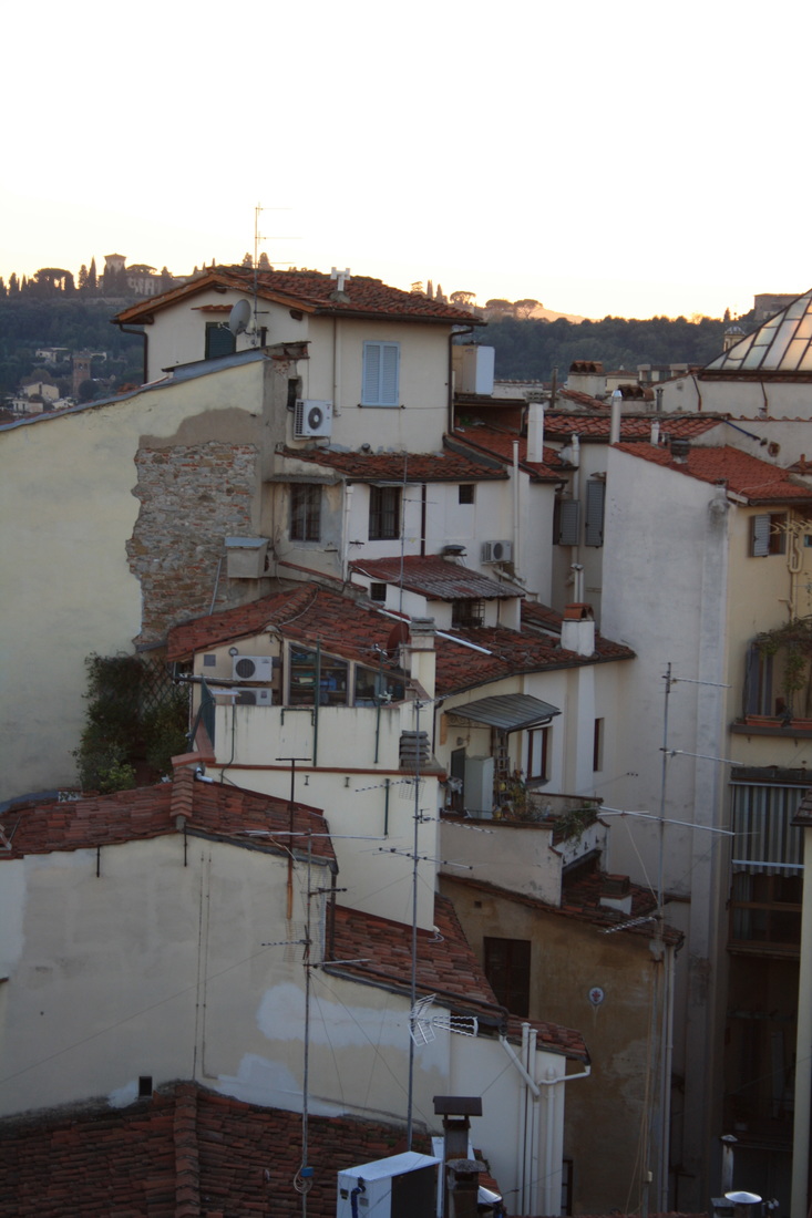
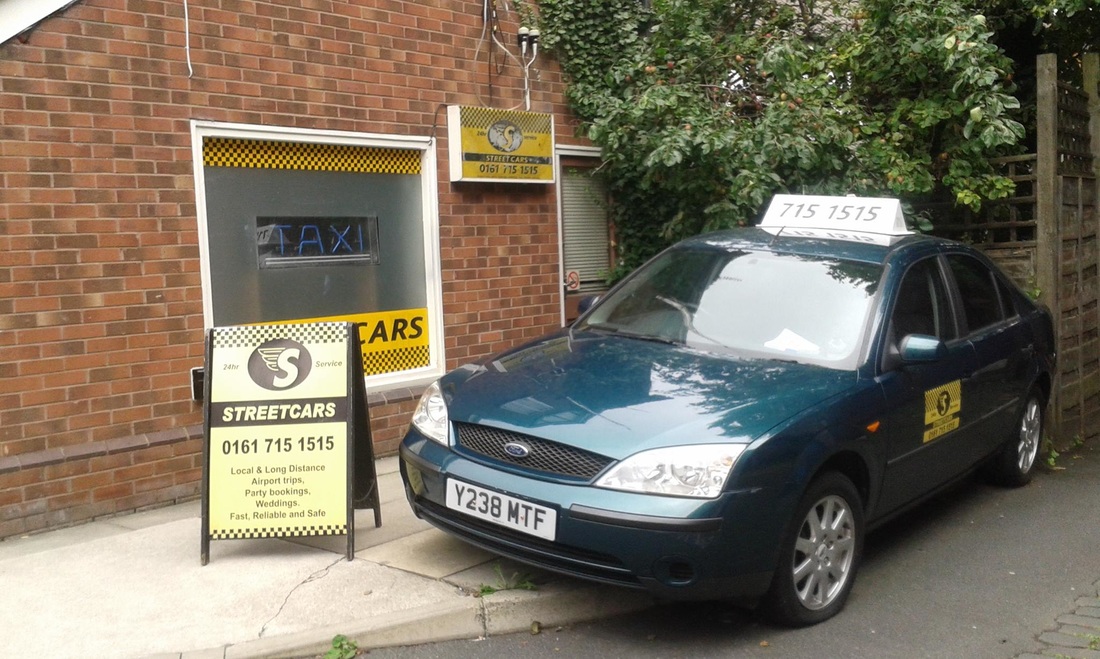
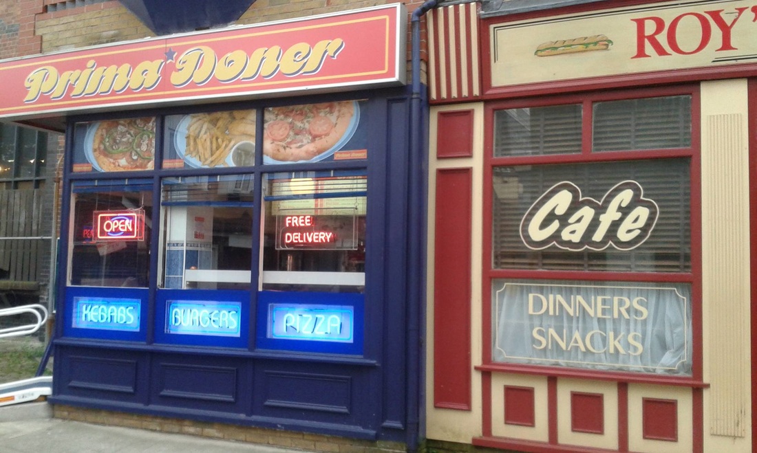
Urban photography
Much of the world's population live in urban surroundings. Photographers have been using this as their inspiration and capture images that tell a story of human lifestyles. I have chosen to look at the topic of the urban landscape using 3 different starting points - Abstract, Repetition and Capturing the moment.
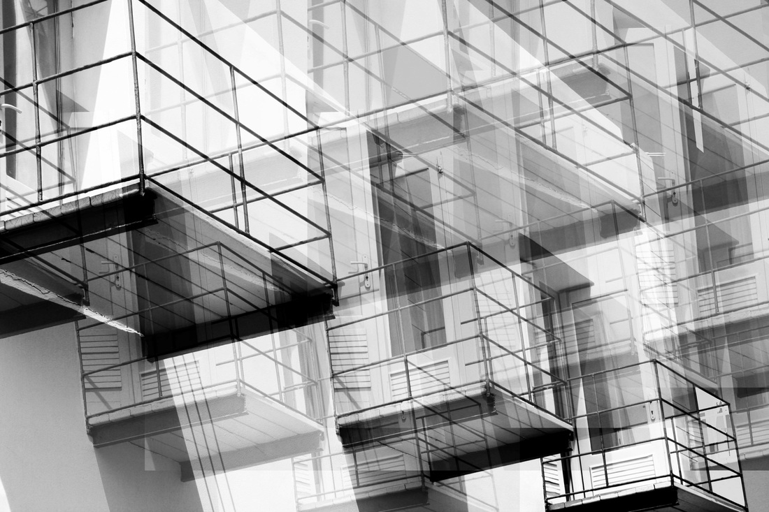
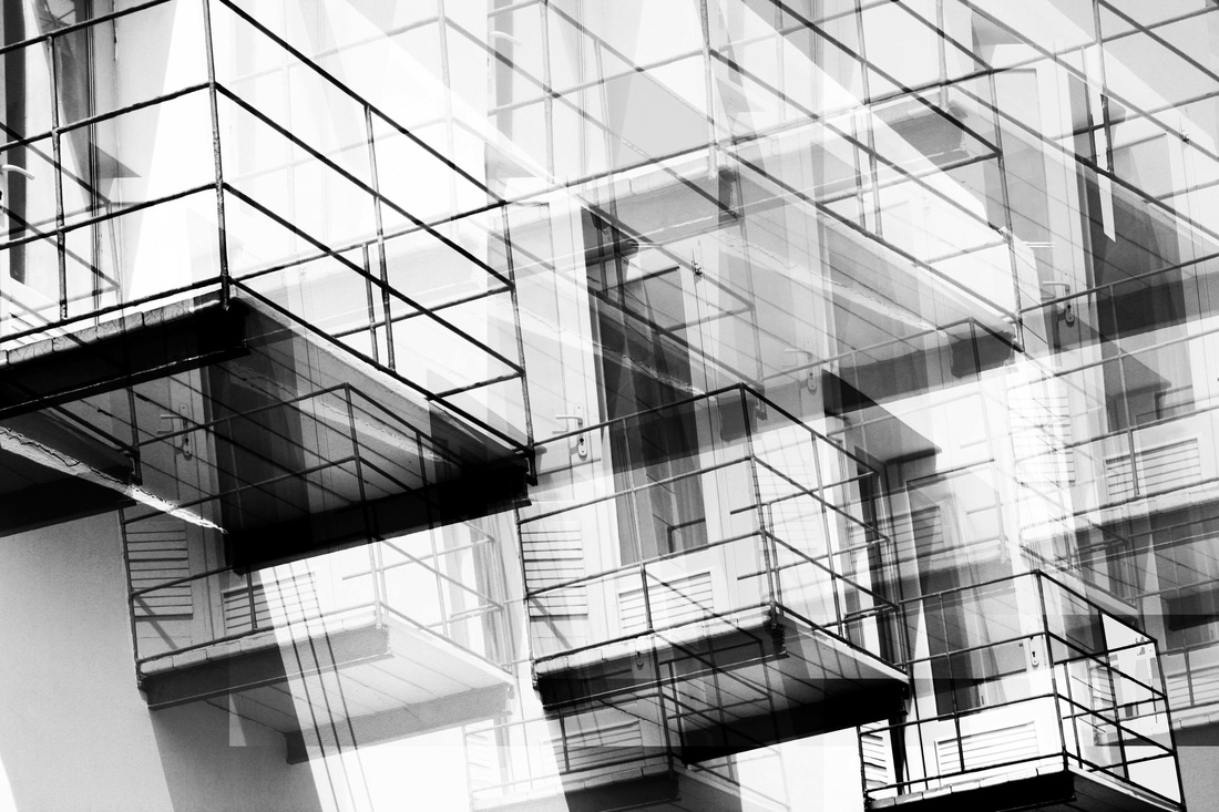
my response to abstract


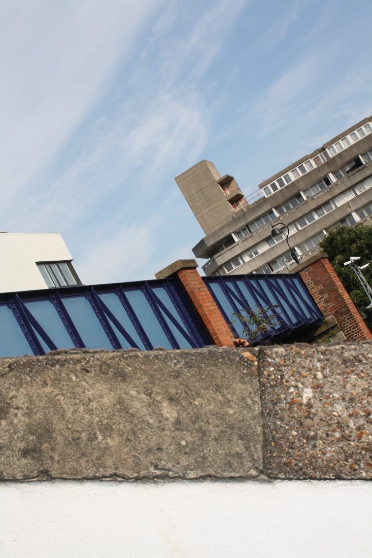
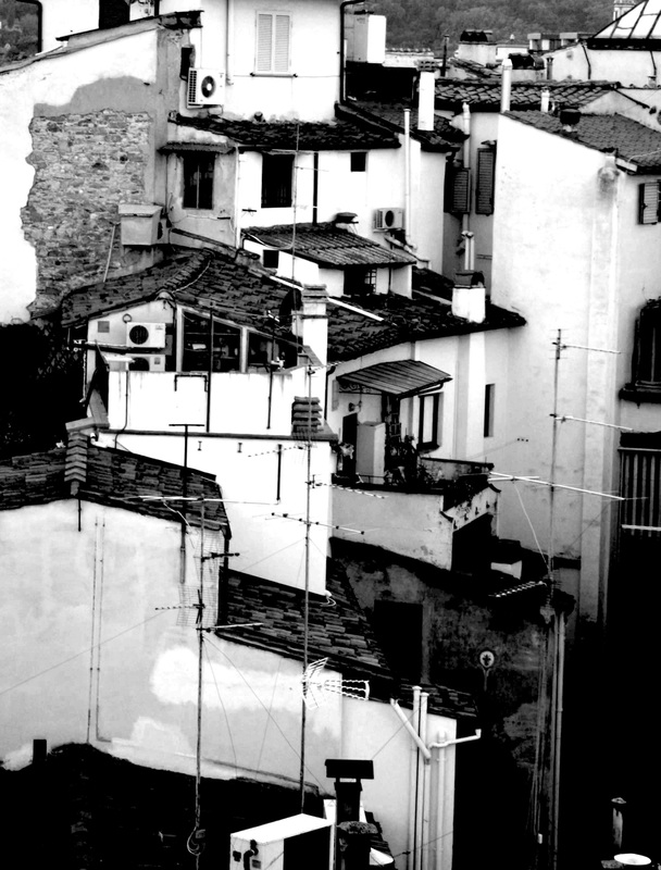
repetition
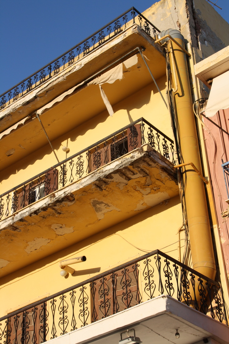
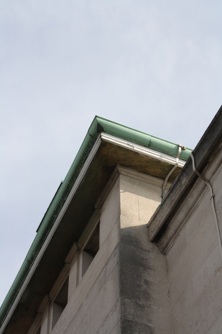
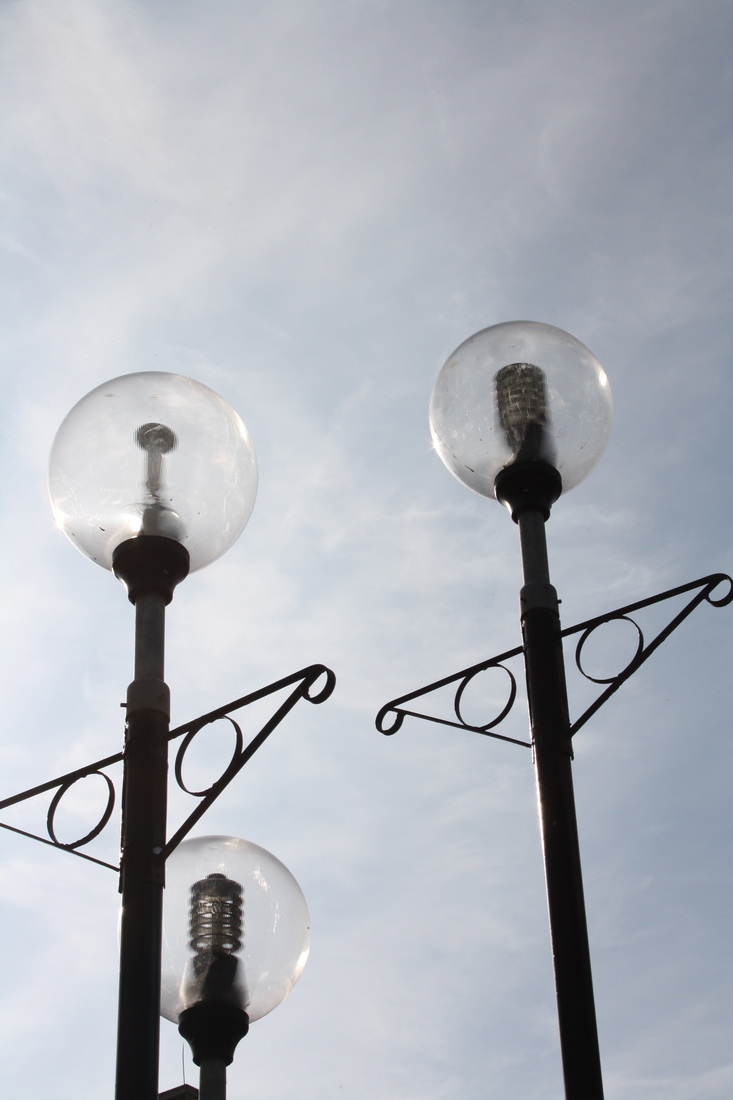
In this first group I have repeated the viewpoint. I stood in the centre of the street looking upwards.

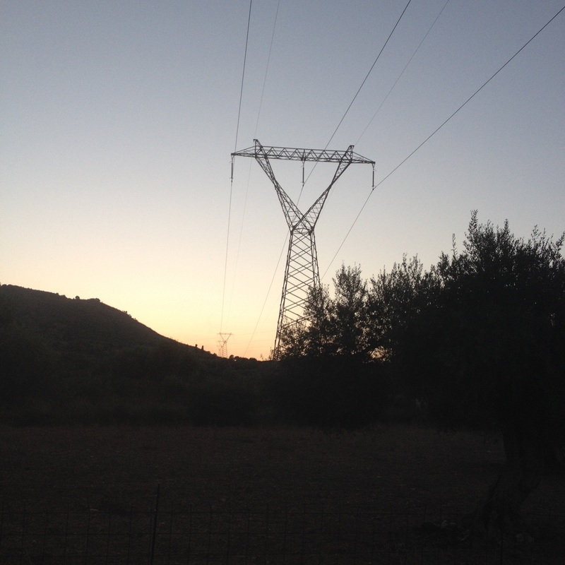
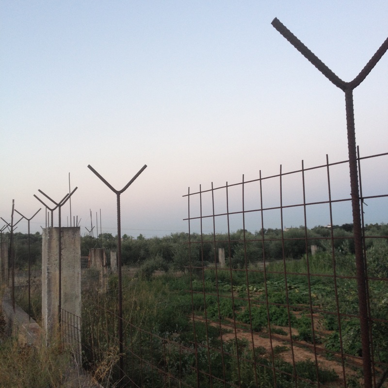
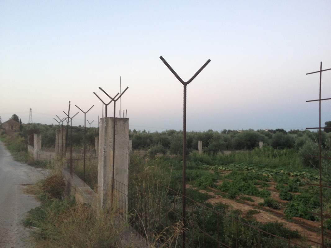
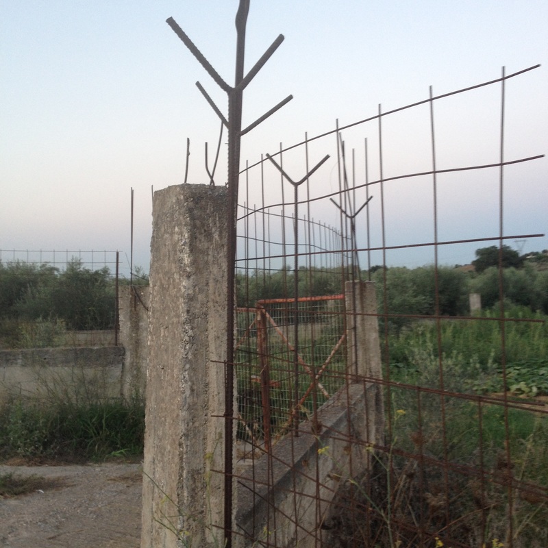
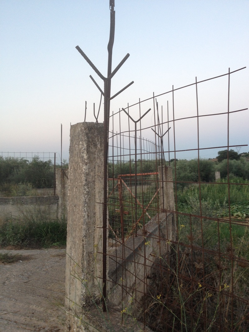
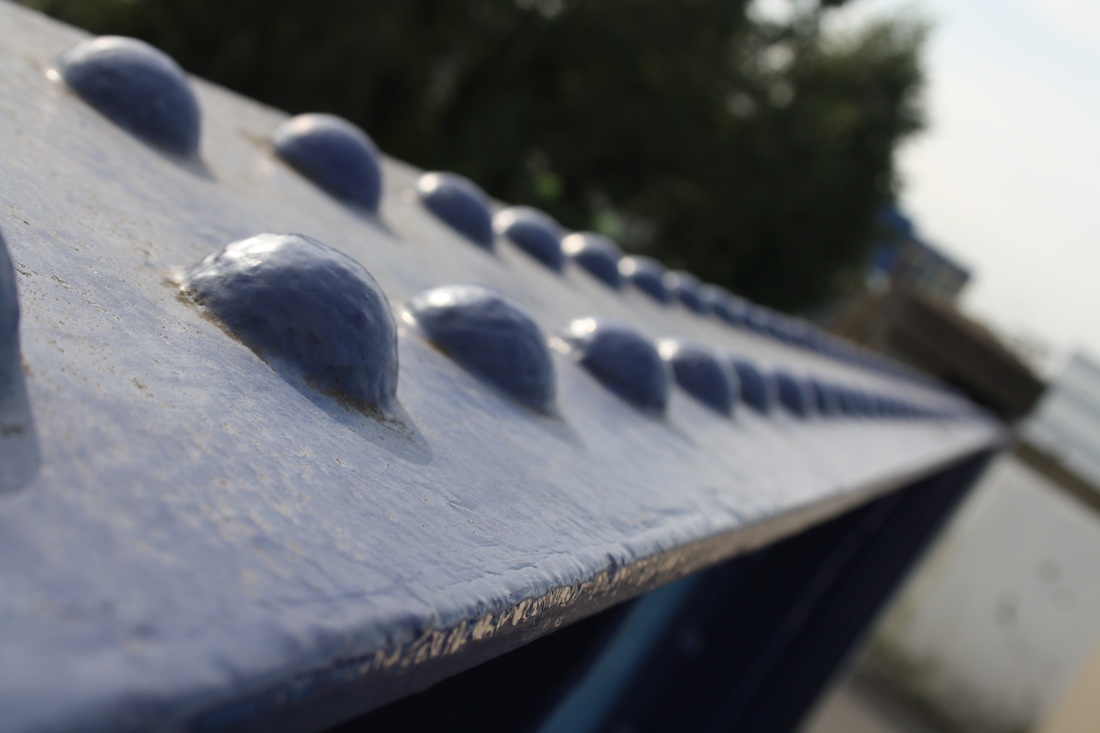
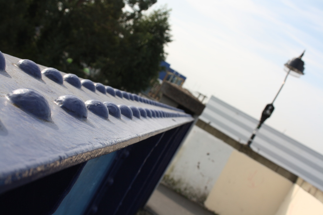
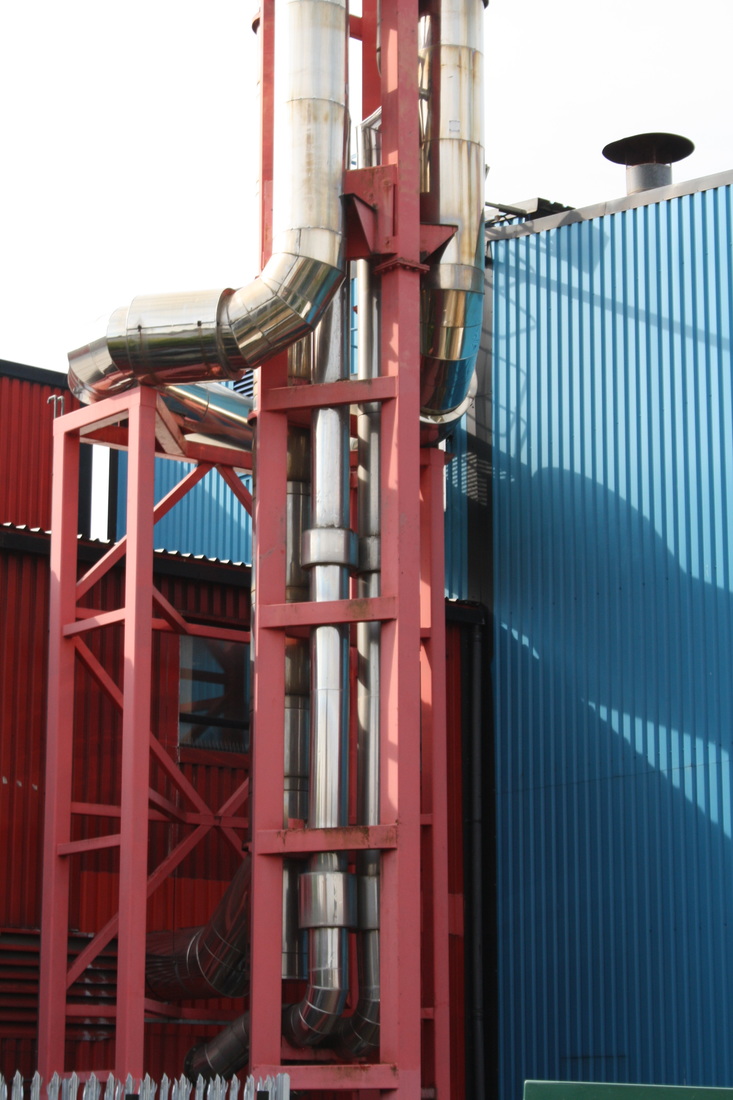
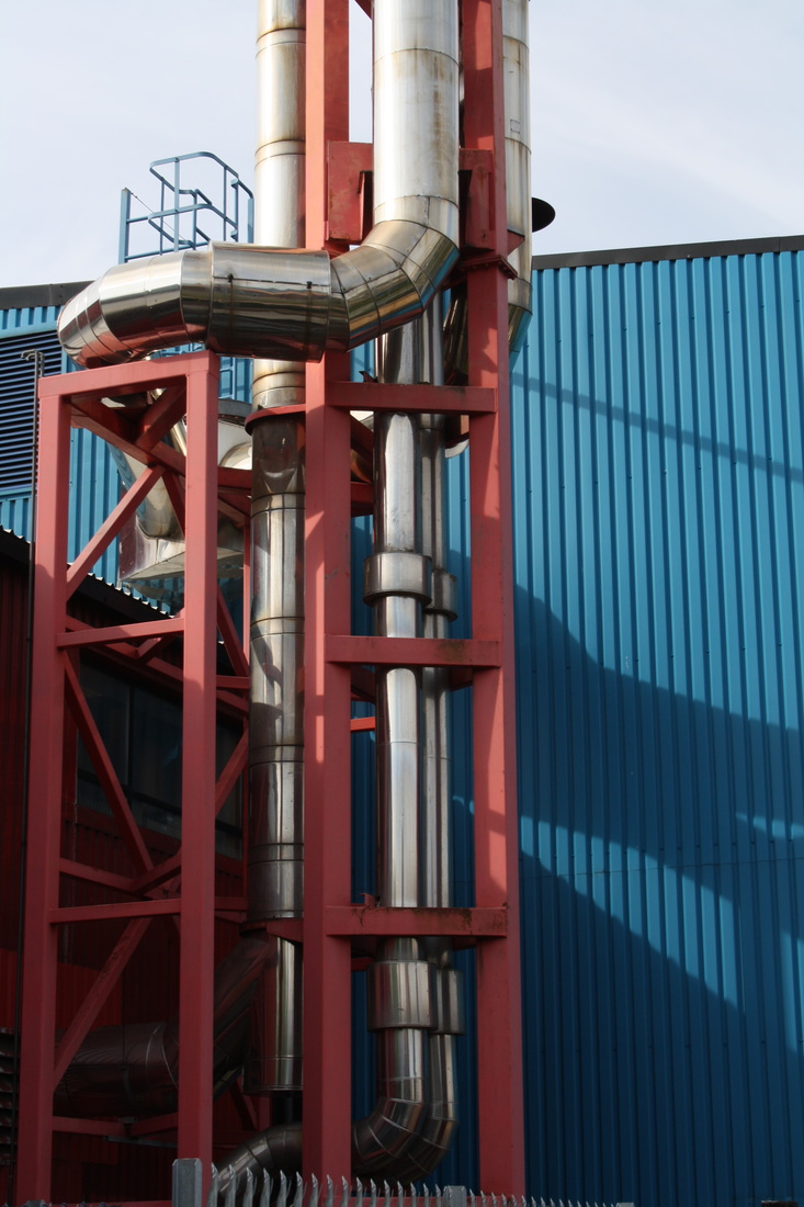
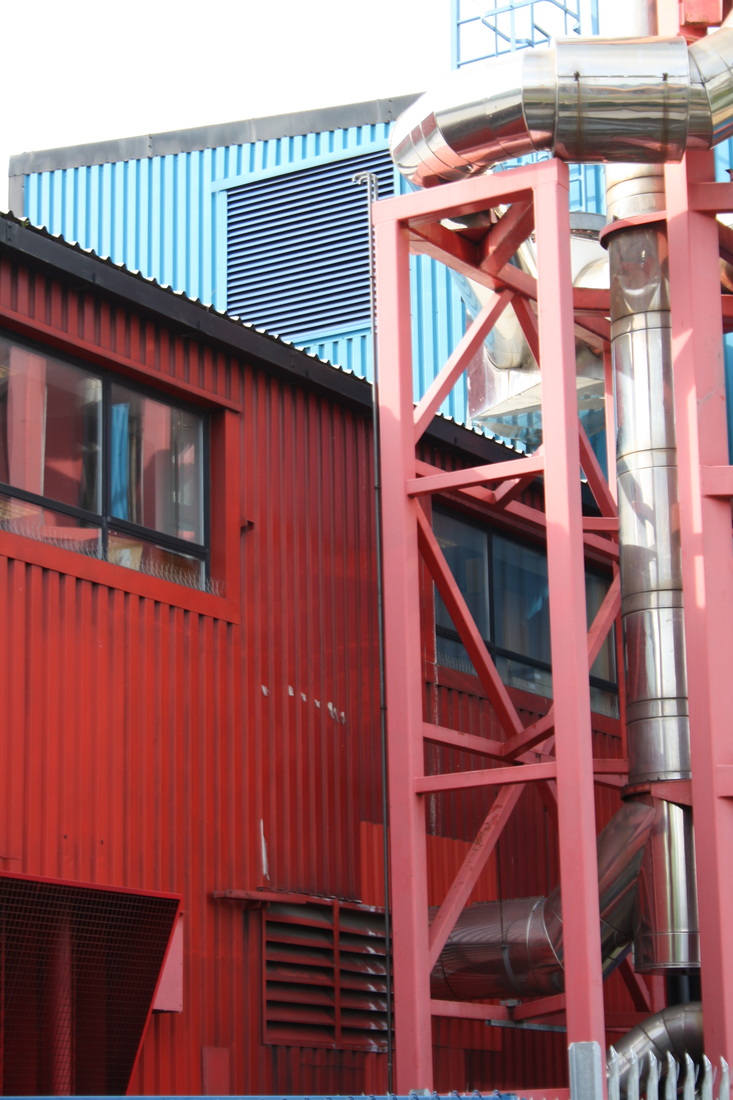
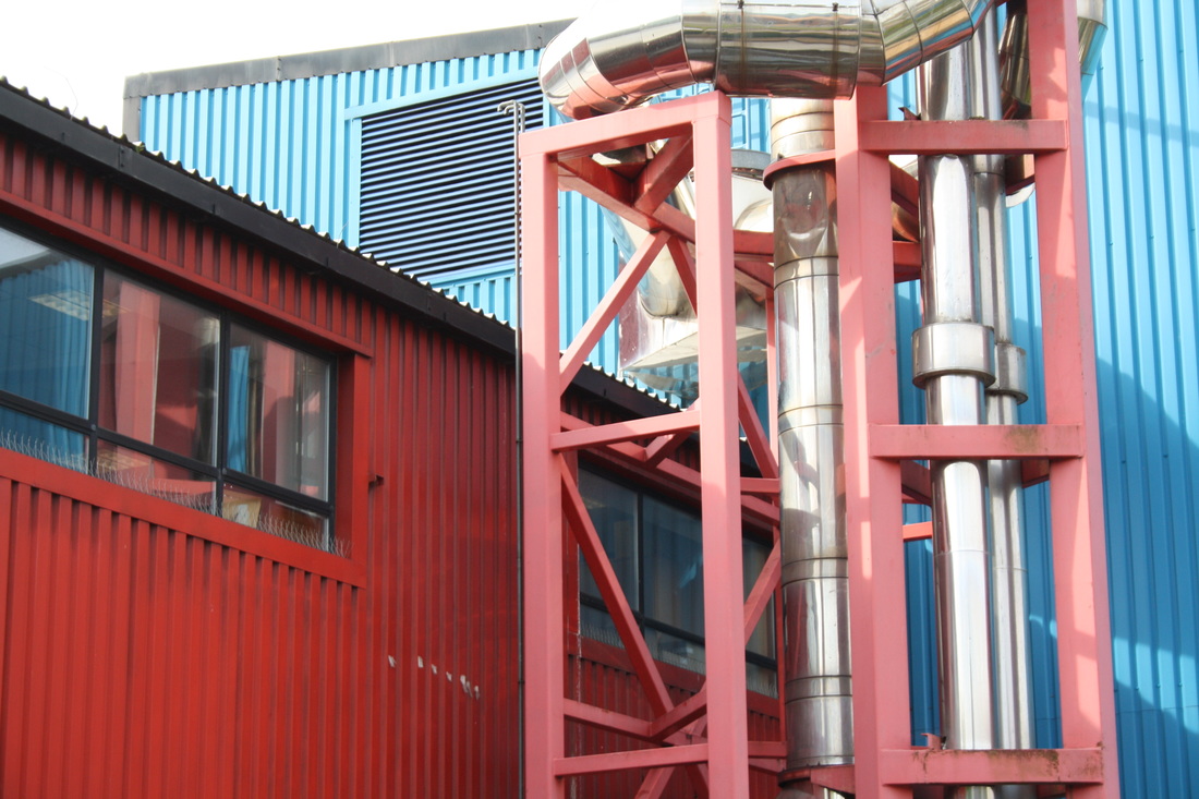
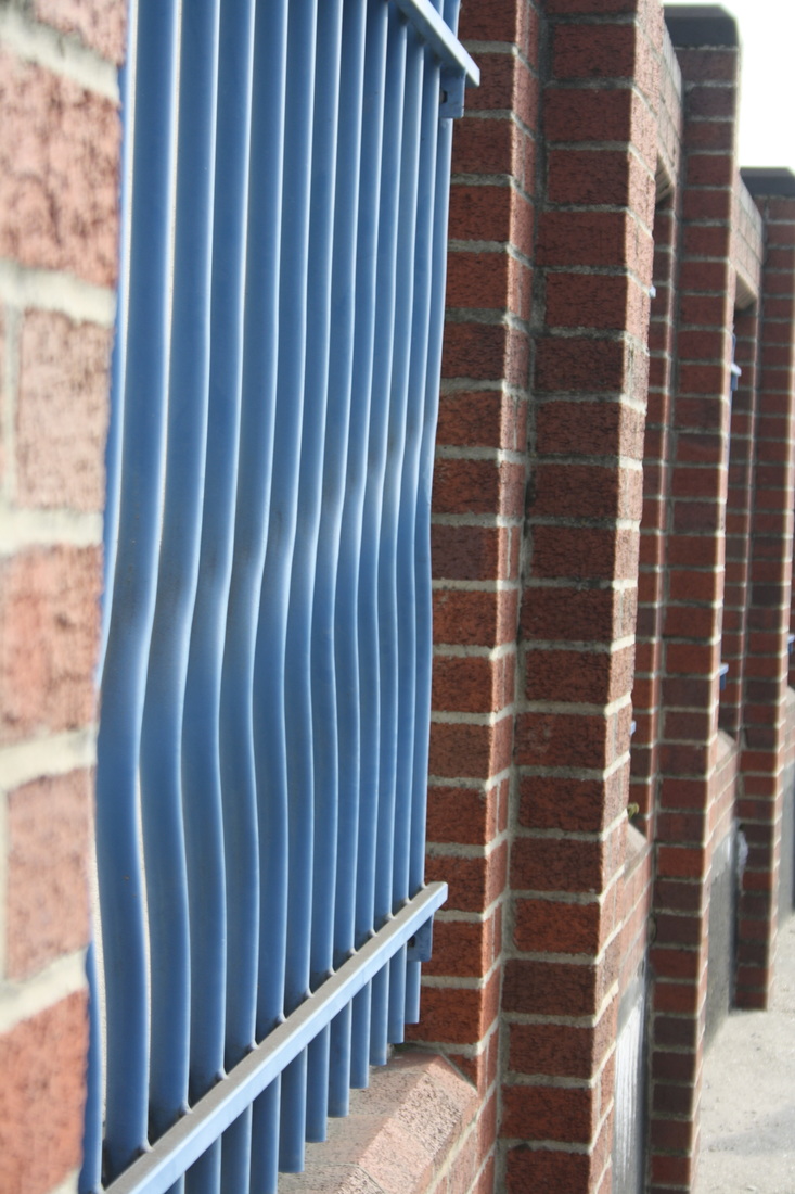
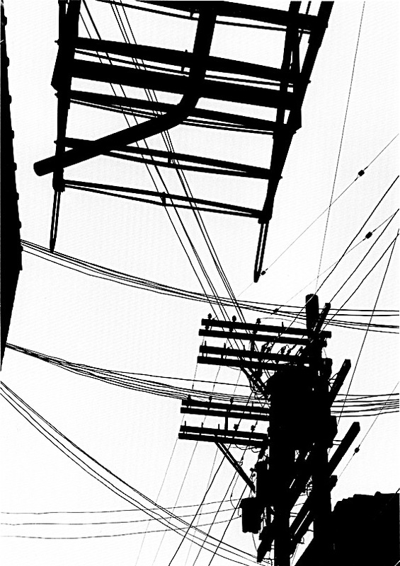
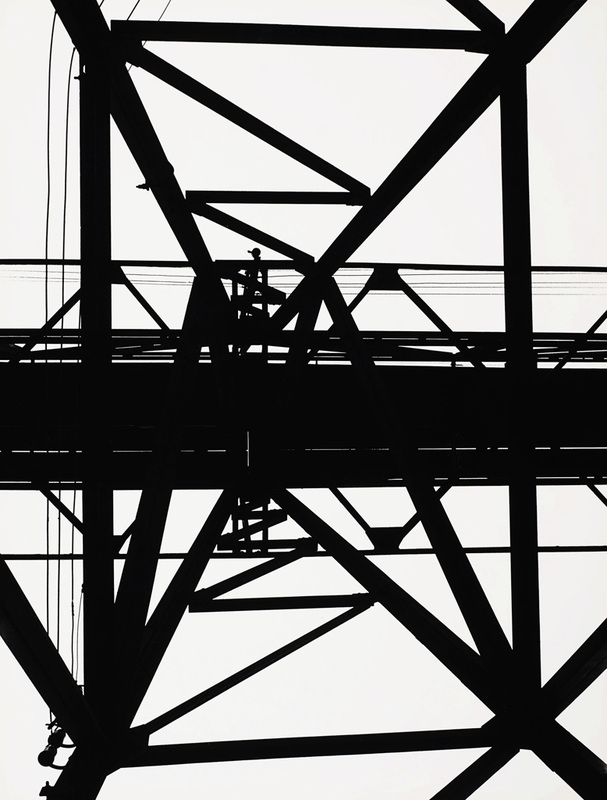
In this second group I was keen to emphasise the repeating metal structutes against the sky.

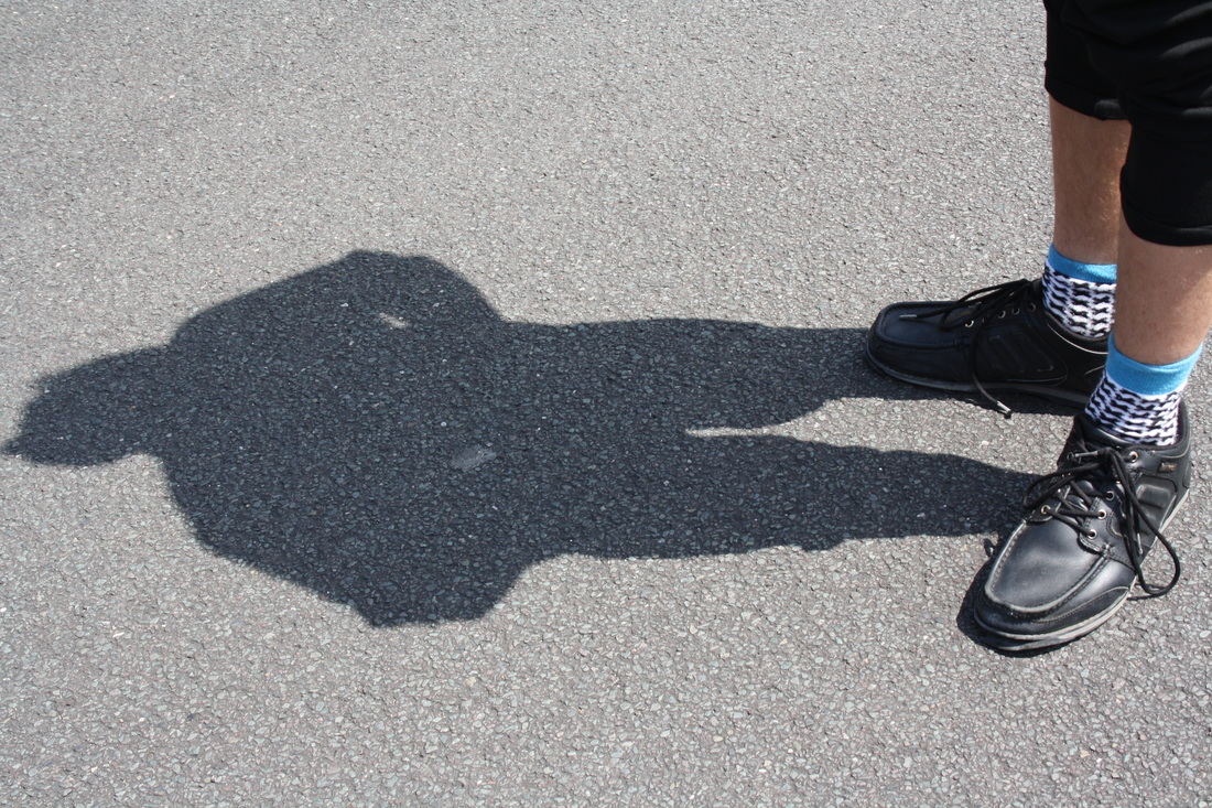
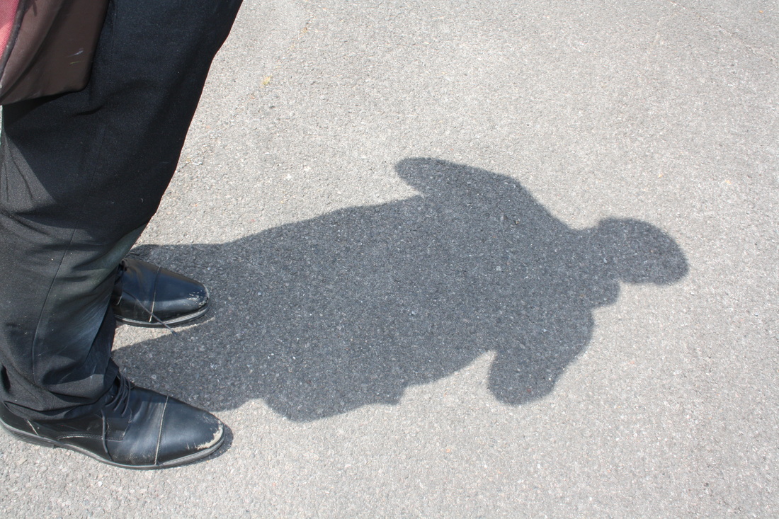
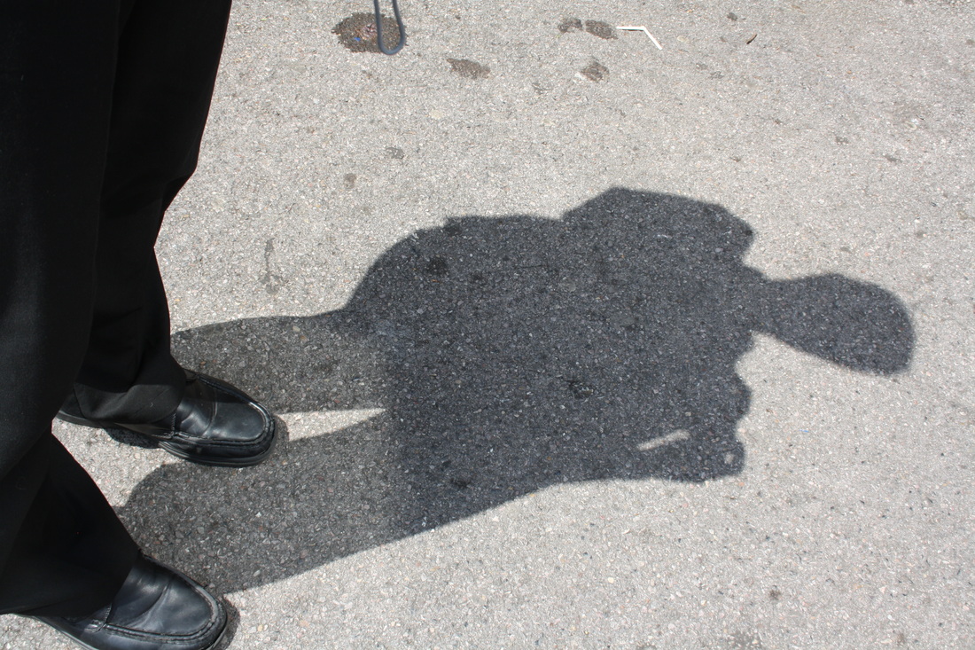
capturing the moment

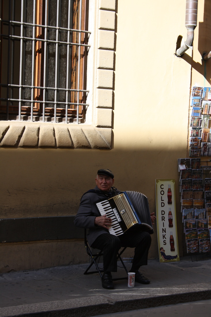
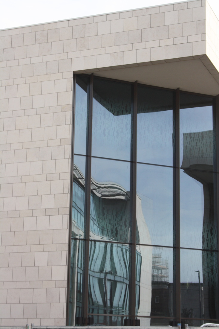
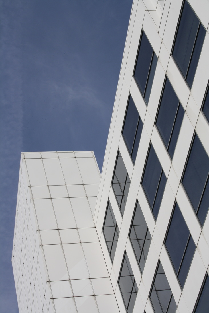
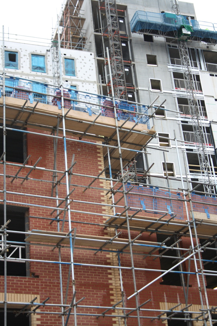
photoshoot - Abstract city centre
Looking up - I took this sequence of photos looking up at different styles of architecture. I like the way the building shapes are silhouetted against the sky.


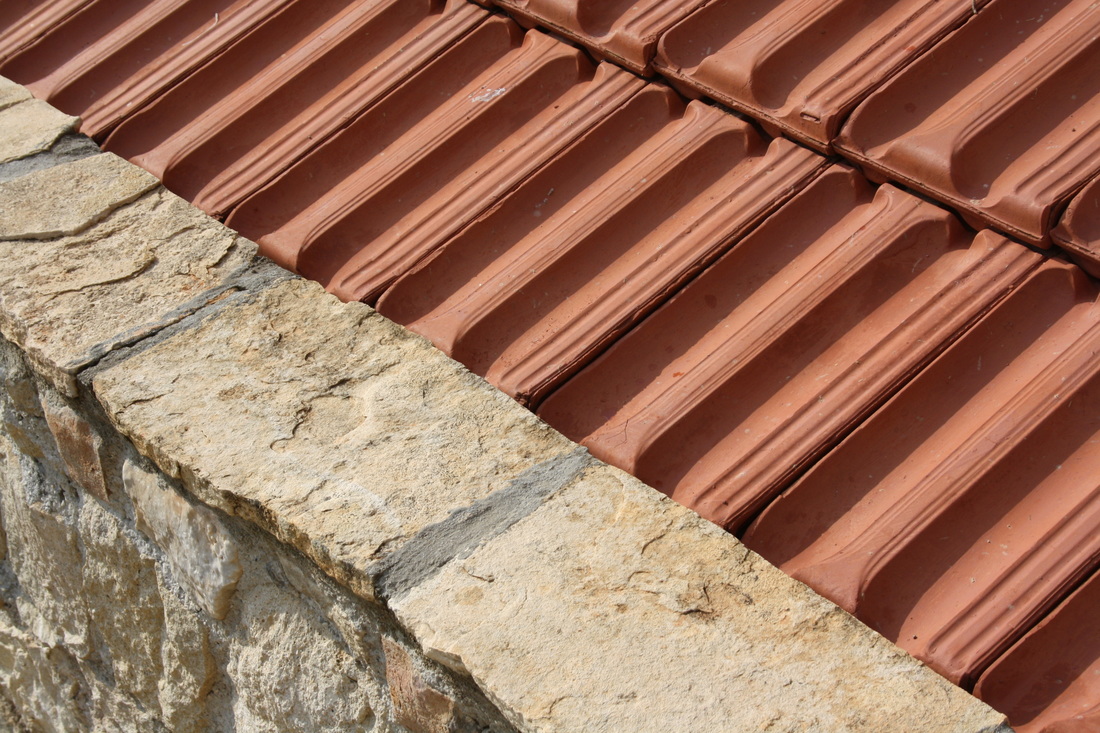
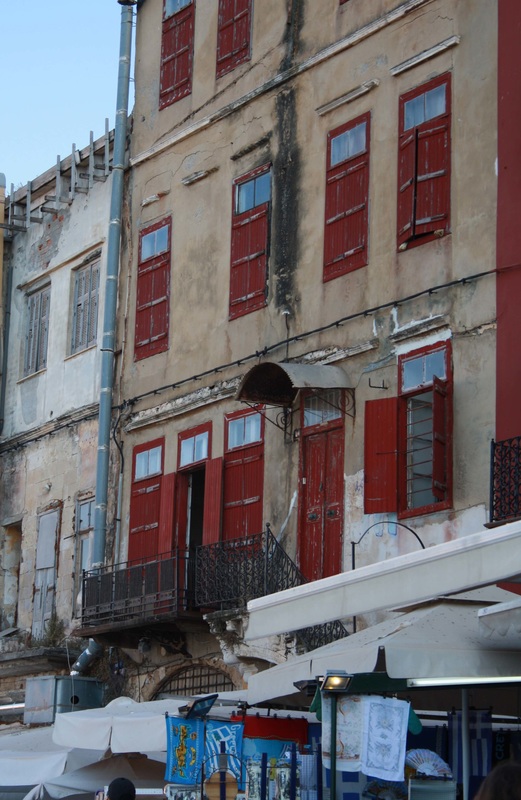
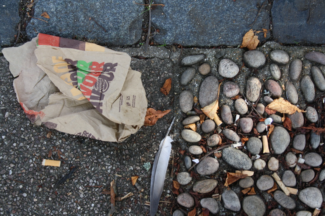
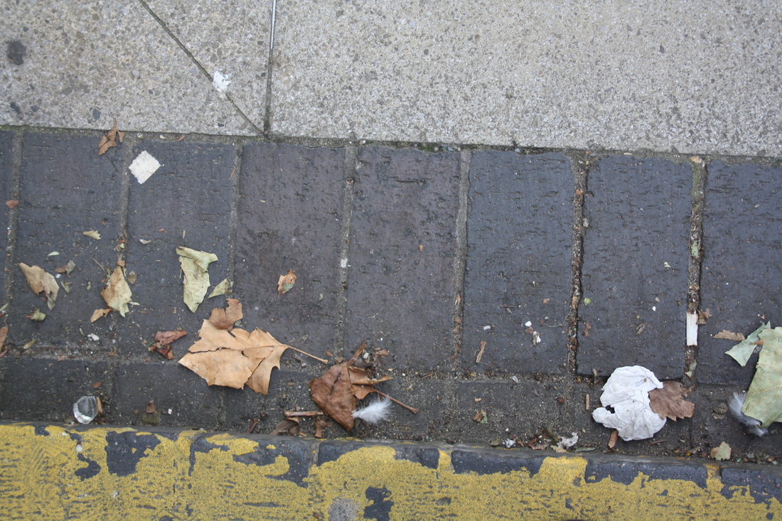
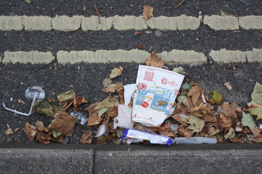
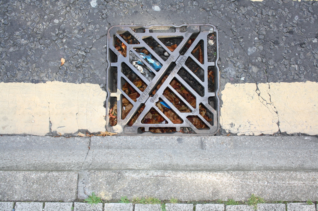
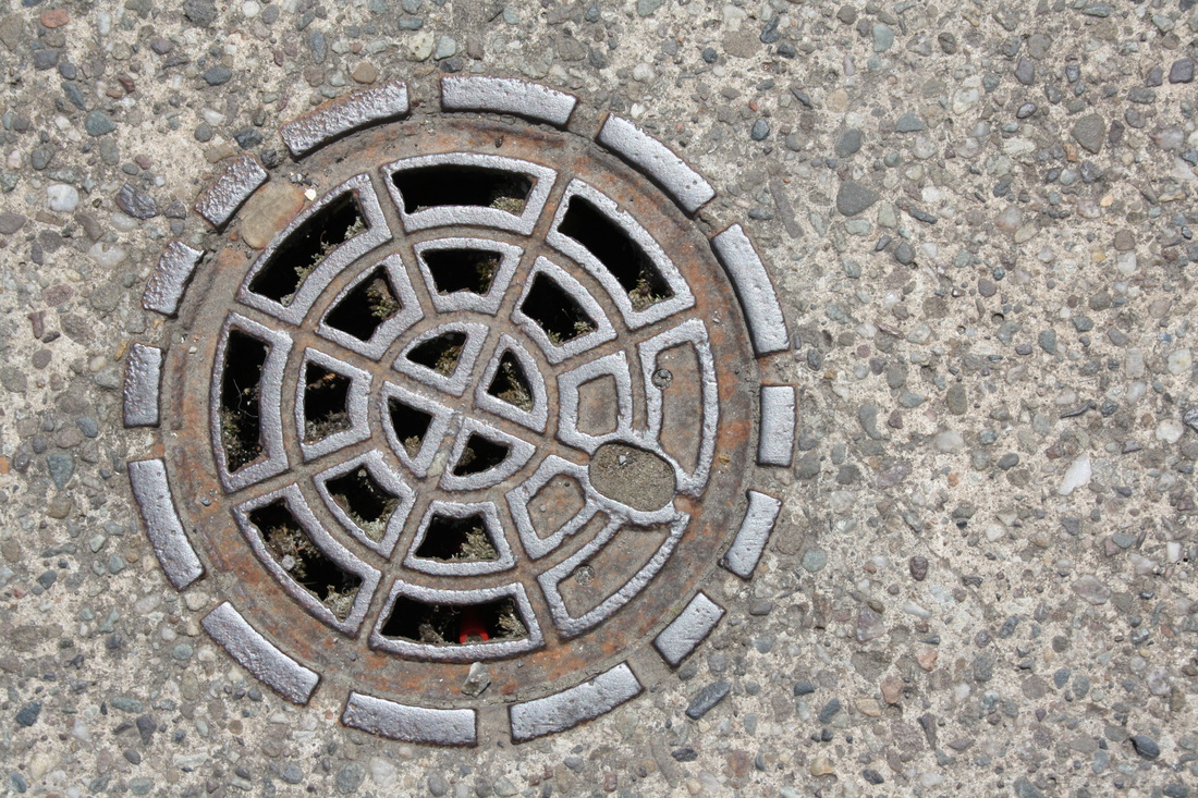
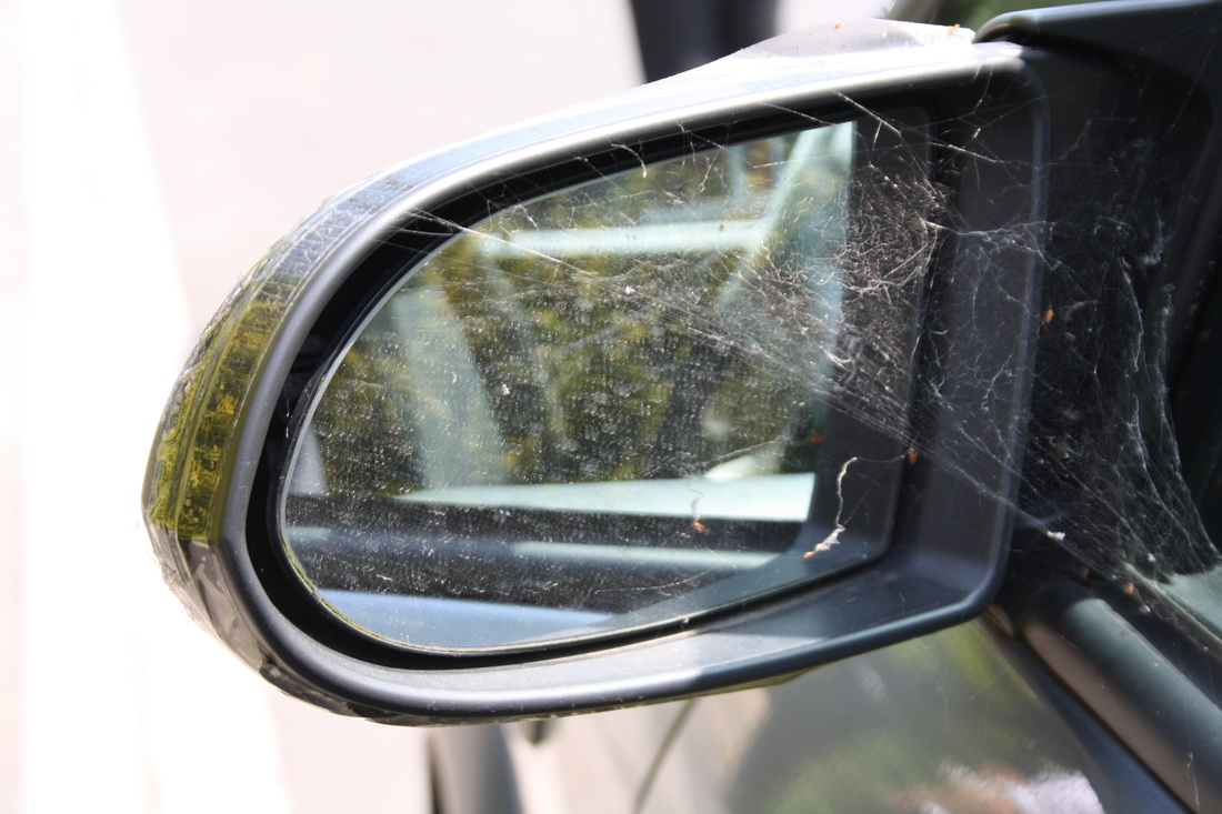
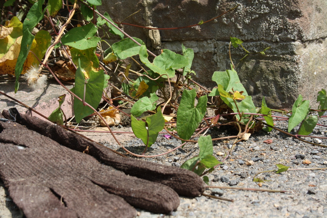
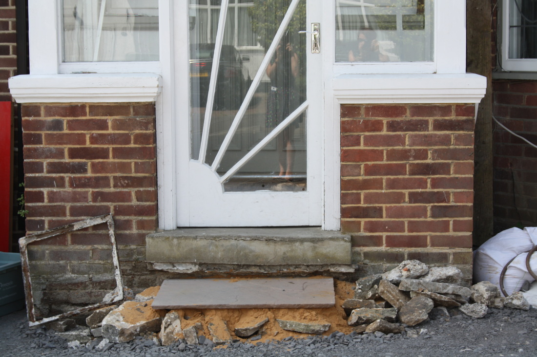
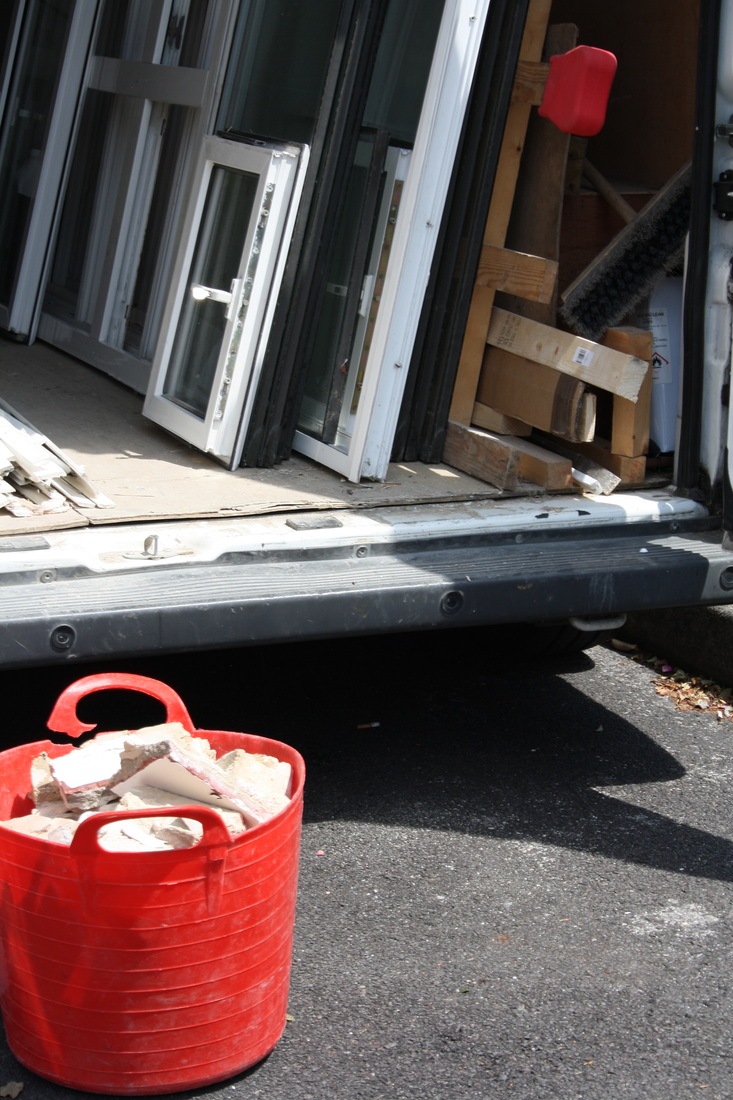
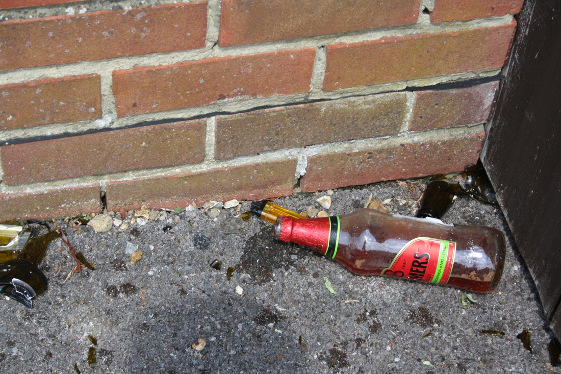
Looking down - The decay and debris left on the street can be seen in this group of photos. I am pleased with the repetition on the curb and colour theme in these images.

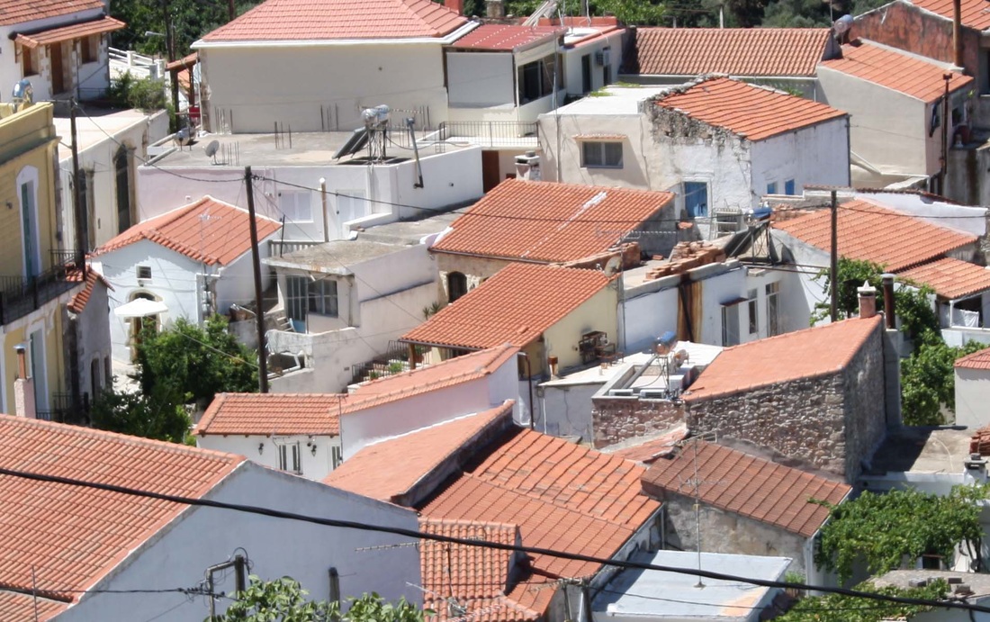
Finding pattern - The shapes and colours in the city buildings created geometric patterns. By cropping and using unusual viewpoints I was able to isolate these patterns and make them the focus of this set of images.


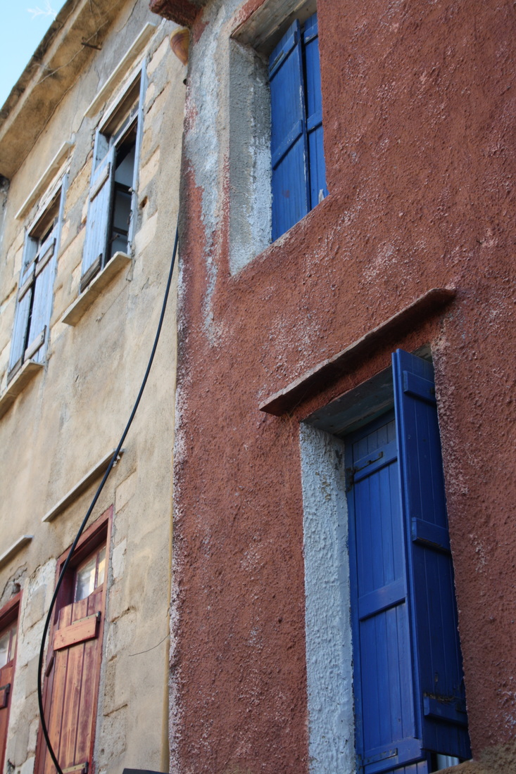
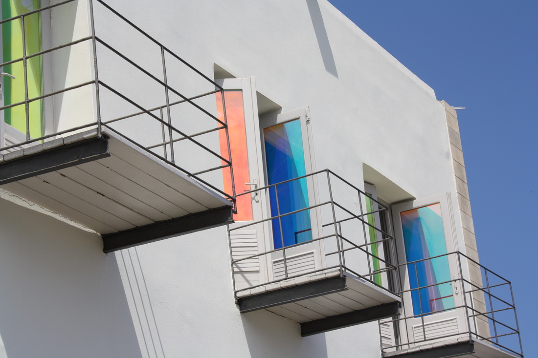
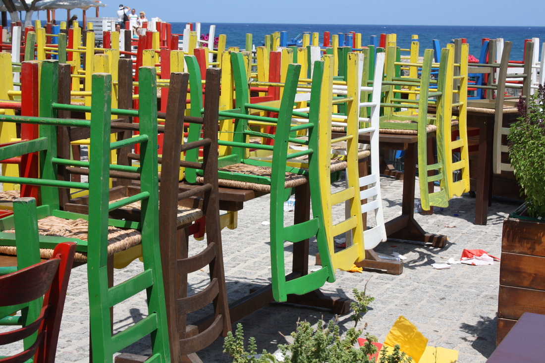
Finding colour - I was able to find un expected colour on the photoshoot and I looked for repetition to emphasize the bright blues and reds that I saw.


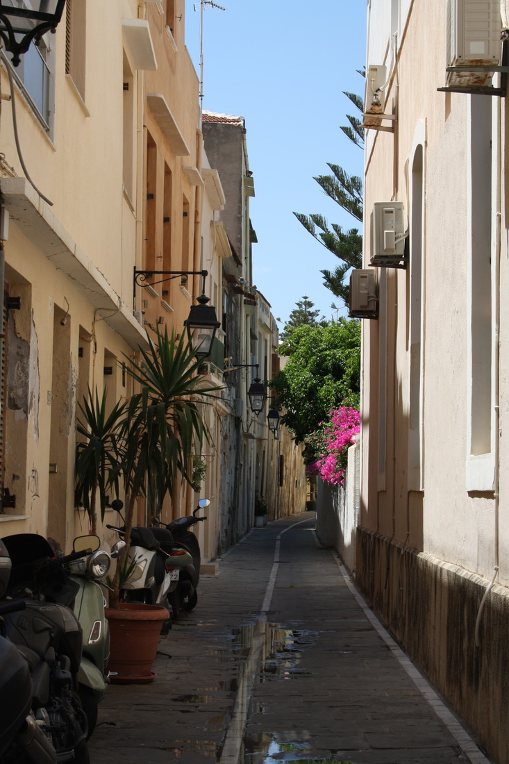
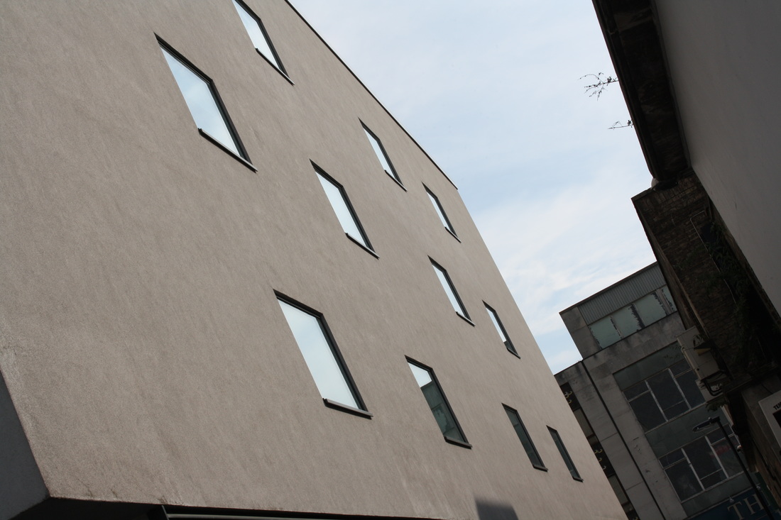
viewpoints
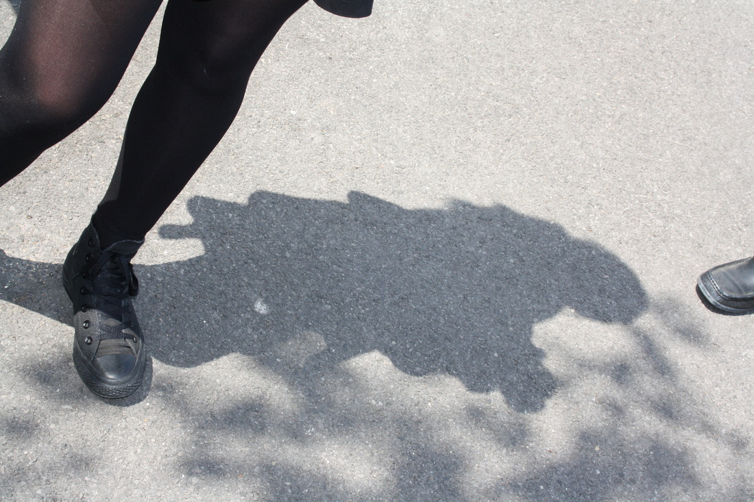
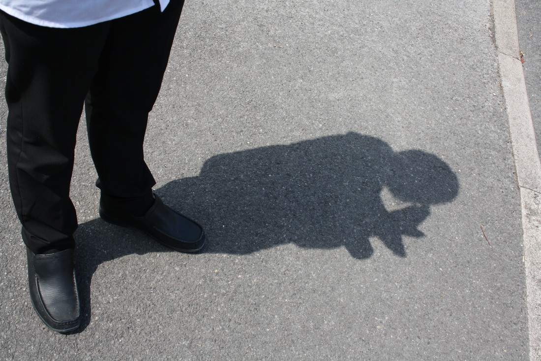
- In these photographs I looked at a suburban street from different viewpoints. I concentrated on
changing the viewpoint
cropping to show pattern
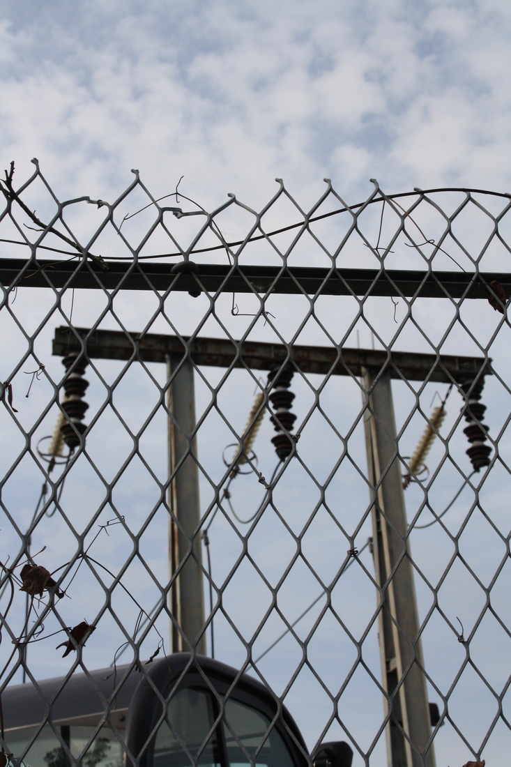
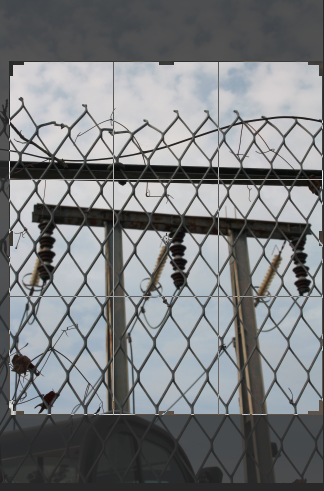
framing the image


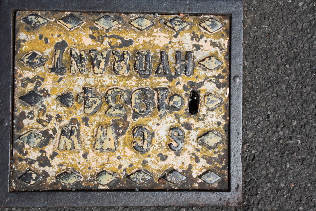
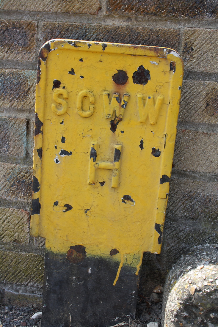


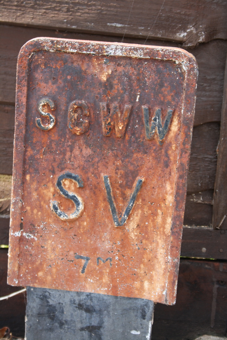

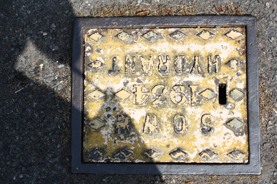
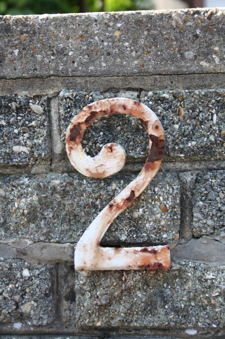


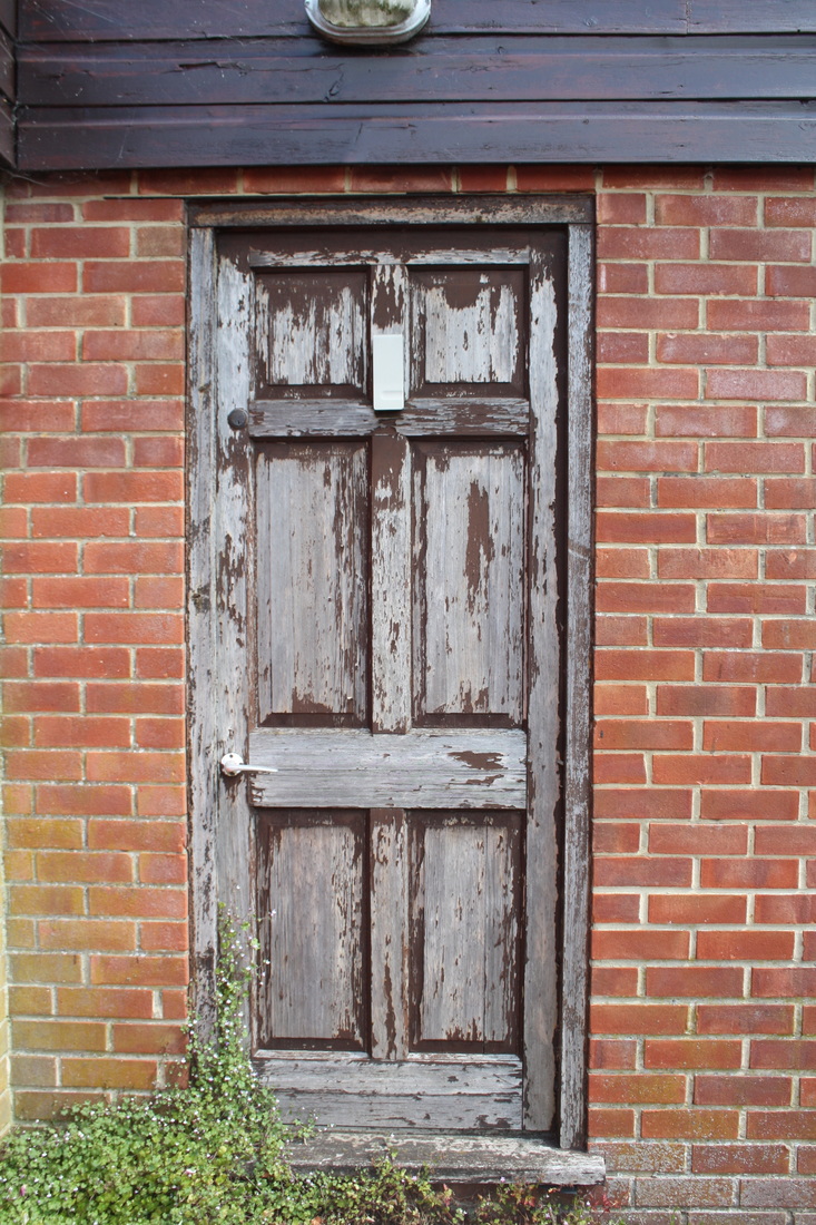
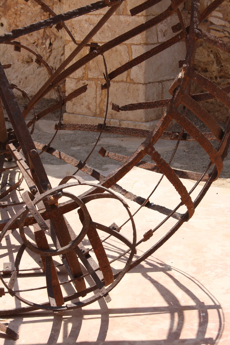
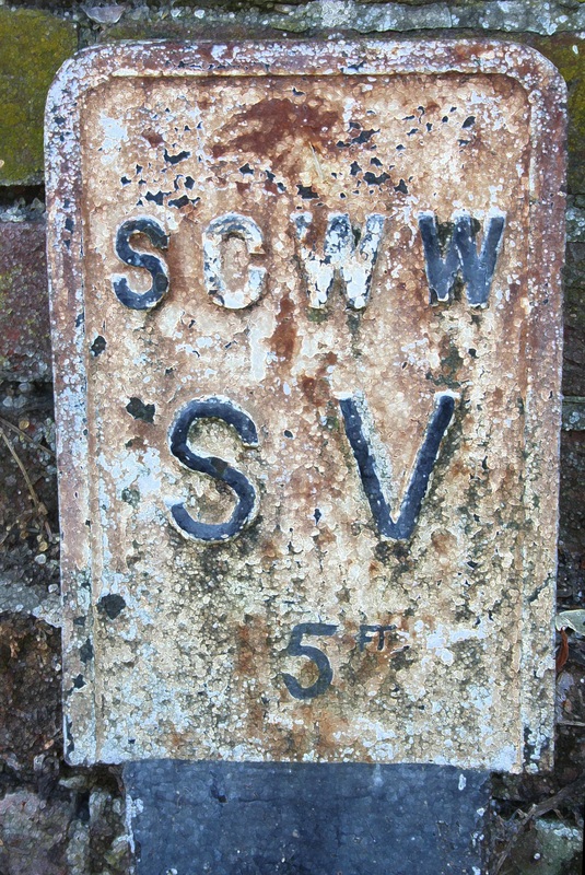
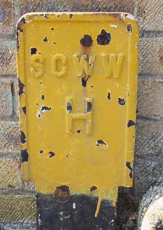
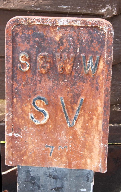
I have noticed that many of the photos have a common theme and when seen together they form a group. I particularly like to rusty decayed signs. To emphasize the peeling paint and rust I used photoshop to add a filter accented edges which heightens the contrast.
|
|
|
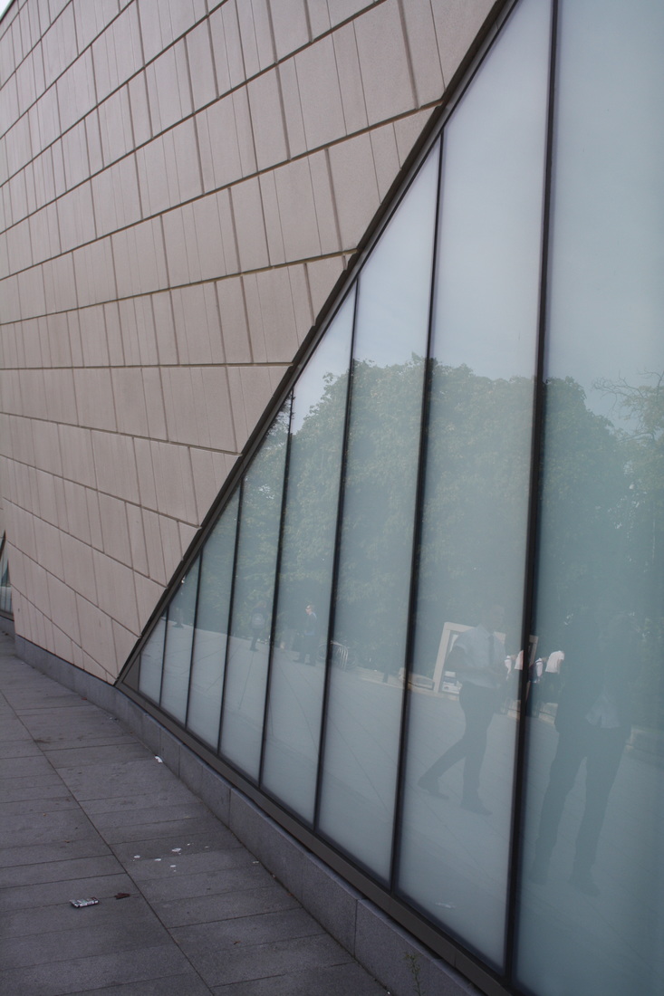
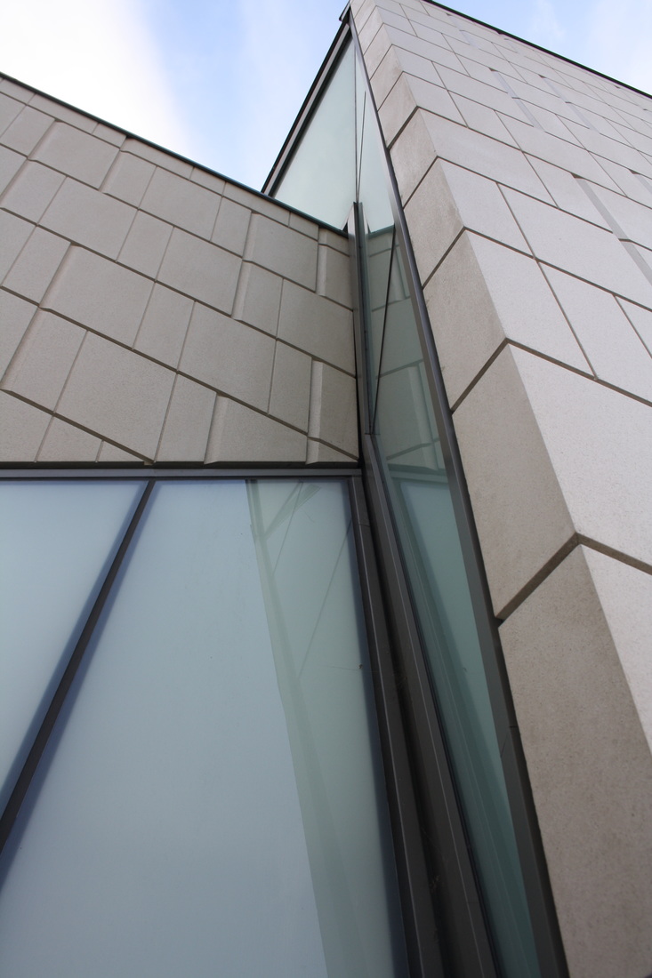
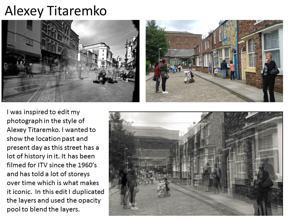
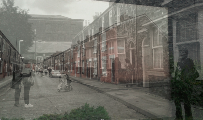
Michael Wolf
|
|
Michael Wolf has used the urban landscape of many cities to inspire his work. His photographs show the patterns and repetition within the architecture of these centres of human population. He has framed each image to focus the viewer's attention on the structures that overlap. In some of his photographs he has captured a moment of human interaction within these permanent gigantic structures. He positions himself at the same height as the buildings he is photographing so that the vertical lines within the buildings are not effected by lines of perspective. This emphasises the repeated vertical lines which show power and strength.
|

|
I particularly pleased with these two photographs I took of the roof tops and sides of the buildings because they have close links with Michael Wolf's Paris roof top photos.
|
|
Moholy-nagy
|
|
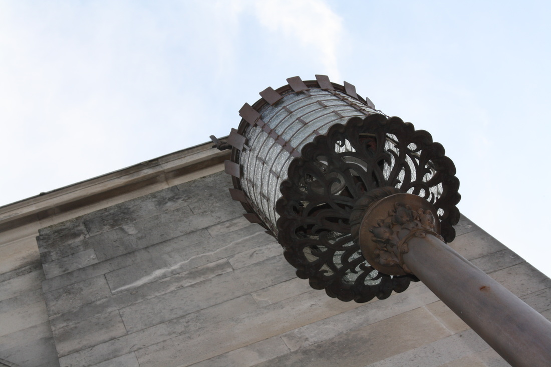
Moholy-Nagy liked photographing buildings
close-up from the ground. He chose modern buildings with sharp, clearly defined
edges and simple shapes. Sometimes he included a figure to give a sense of
scale. When you stand close to a tall structure and look up the perspective is
exaggerated. The resulting images can be quite abstract.
|
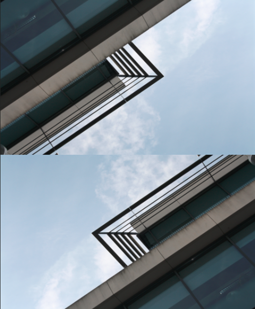
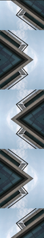
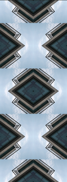
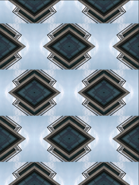
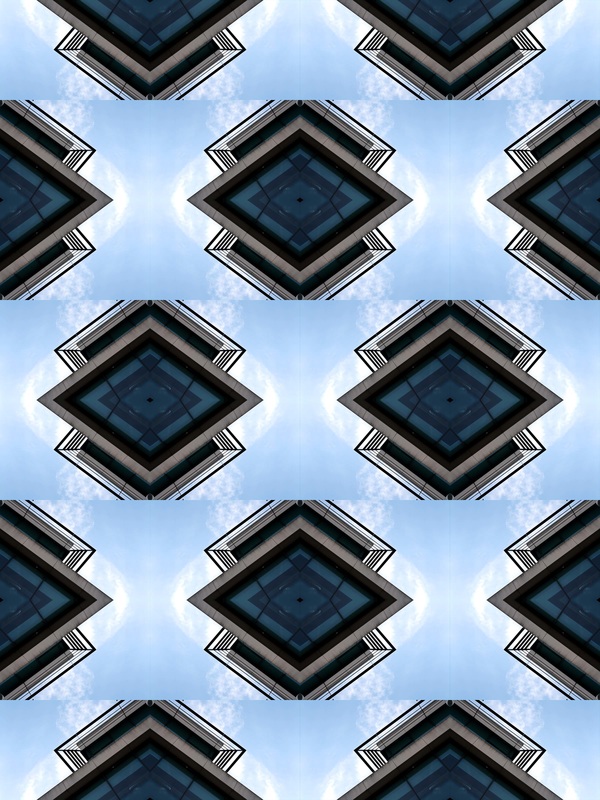
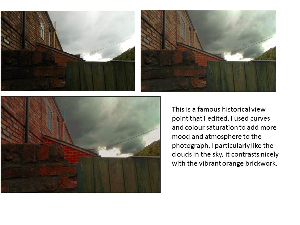
My response to looking up
|
Looking up has made a distinct shape against the sky. I used photoshop to repeat this image, flipping it to create a new pattern.
|
|
|
|
|
|
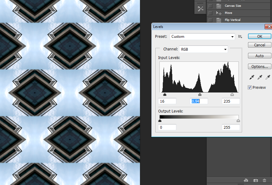
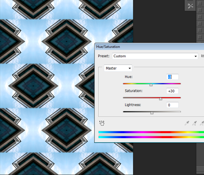
To further develop the pattern I adjusted the levels to create more of a contrast and make the clouds in the sky stand out more. Finally, I increase the saturation of the colour.
|
|
Keld Helmer Peterson
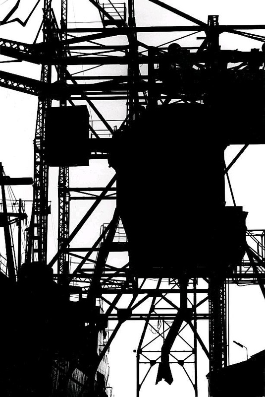    |
The silhouettes that are created by these highly contrasted photographs show the stark industrial nature of the urban environment. Peterson focused on the composition with lines and shapes overlapping to make the bold photographs.
I am inspired by this approach and will use the elements of line and contrast to investigate my urban environment. |
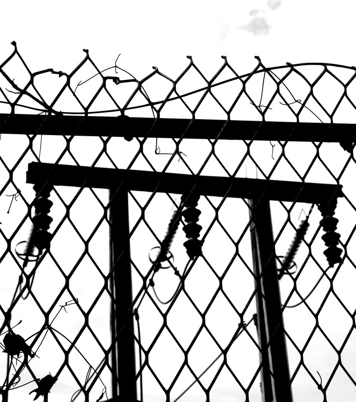
using Peterson's techniques
I choose this photograph because of the patterns and vertical structures
|
I cropped this to make the vertical lines and top horizontal lines fit into the rule of thirds.
|
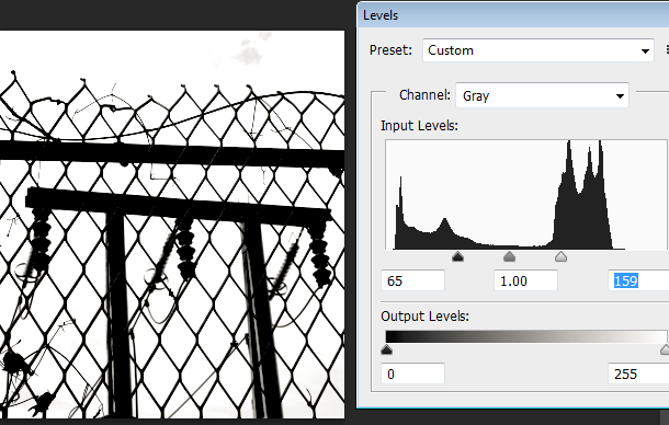
To emphasis the structures I made it black and white and increased the contrast using the levels tool.
|
|
|
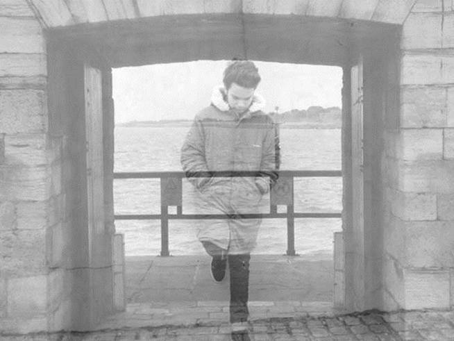
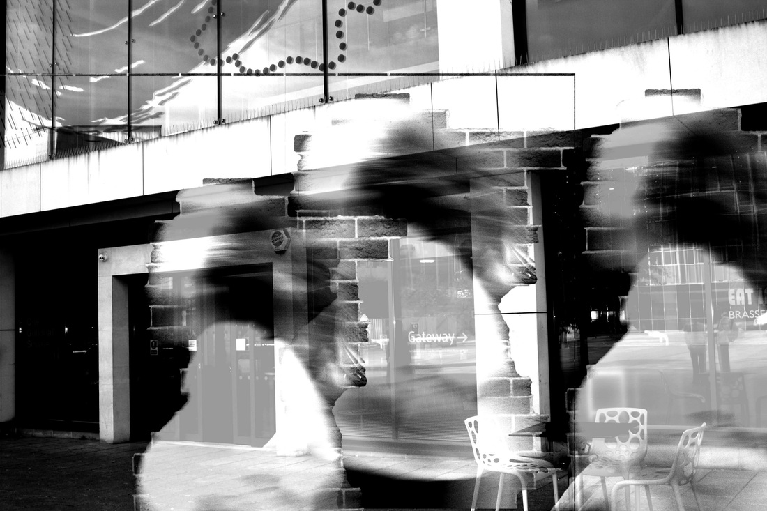
To refine my response to the urban landscape I wanted to combine a human element with the strong architecture I had photographed. To start with I combined 2 photographs by layering them together.
|
|
|
|
|
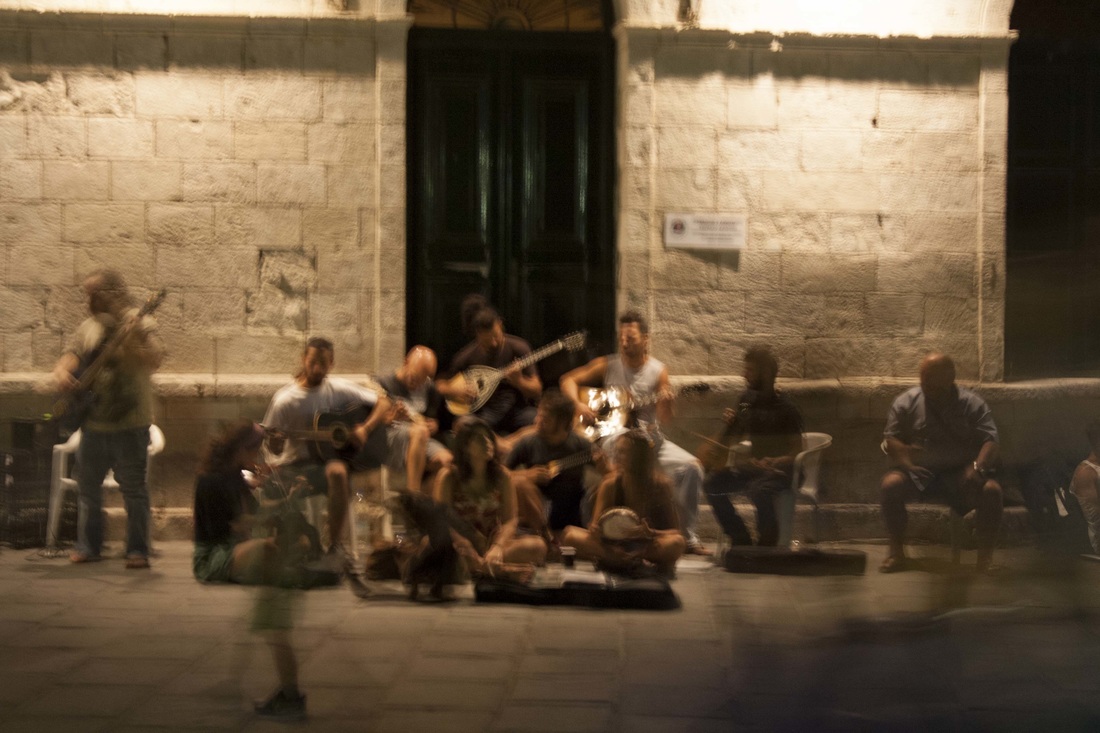
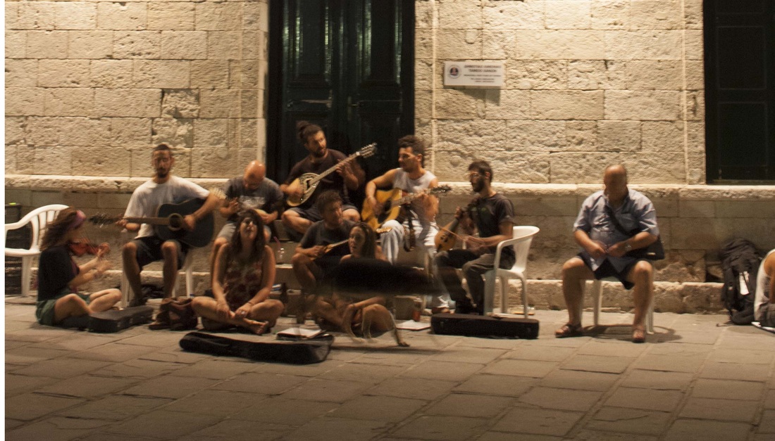
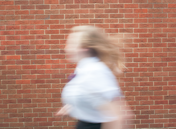
Thinking about showing movement, I was inspired by Alexey Titaremko and Trent Parke. I like the way that the blurred lines show fragments of faces. They both capture the frantic nature of busy urban spaces.
|
|
|
I have layered a blurred image of a person running over a strong view of a modern building. I am pleased with the overall effect of using monochrome and high contrast to emphasize the harsh light and therefore harsh environment of the city. To improve these I would like to combine a more complex photograph of movement.
|
|
|
|
refining my ideas
my most successful photographs


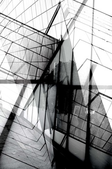
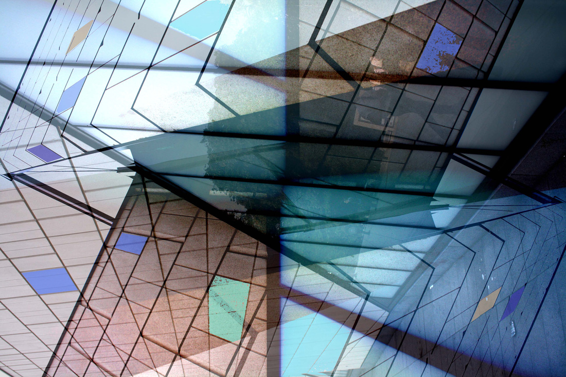
By selecting these photographs I am starting to see the links between them and will use this as my inspiration to develop a final piece. I am interested in combining the structures and bold lines in the buildings. To do this I have chosen these 2 images.
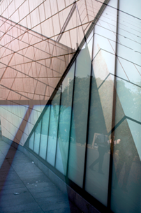
I selected this image because of the bold lines and sharp angles
|

I selected this image because of the diagonal symmetry
|
I layered the 2 images together and made the top layer opaque to combine the 2 structures
|
I increases the contrast and vibrancy of the colours. This has made the diagonal lines more dominant.
|
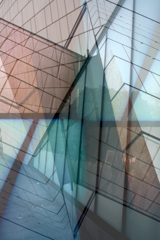
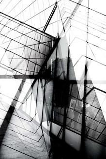
I then added a third layer of the same image and rotated by 180 degrees. This has made a horizontal line across the middle. I like the way the symmetry is becoming more obvious.
|
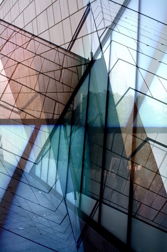
Using the curves tool, I emphasized the symmetry and pattern by adjusting the contrast and colour saturation.
|
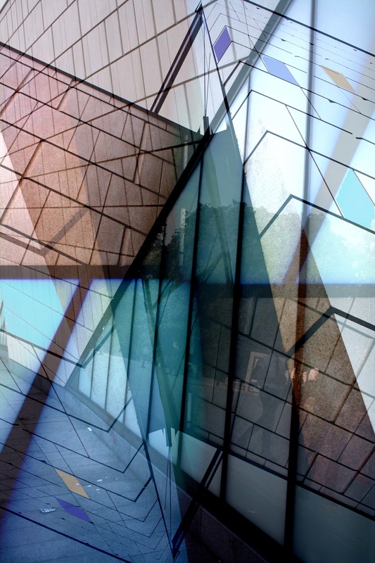
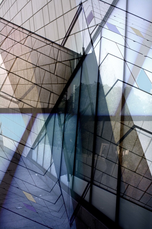
To complete the editing process, I wanted to link the limited colour palette I have used. I filled diamond shaped areas of the windows with stronger colours. This reminds me of a stained glass window.
|
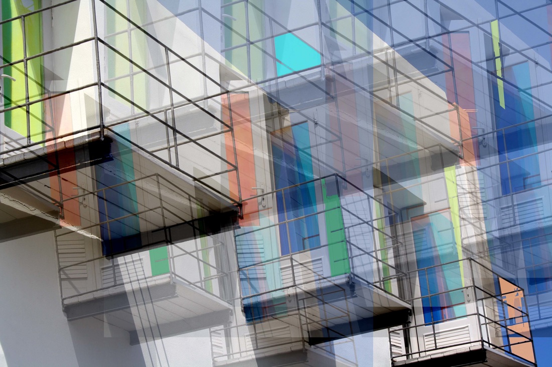
Using an alternate image

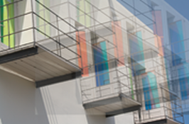
I have chosen this because of the bold lines and jewel like colours.
|
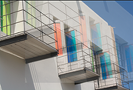
To create a repeated pattern I have duplicated the image and moved it diagonally.
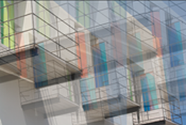
|
I repeated this process making each layer more opaque.
|
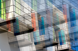
I repeated the process to fill the frame making a complicated structure. Using the curves tool, I made the contrast greater to make the black lines bolder.
|

Finally I created extra areas of the pastel colours, rather like the previous image.
|
Using the influence of the photographers Wolf and Peterson, I experimented with varying the colour and using black and white only.
|
|
|
|
|
|
I refined this new photo using the same colour variation and black and white.
|
|
|
developing a final piece
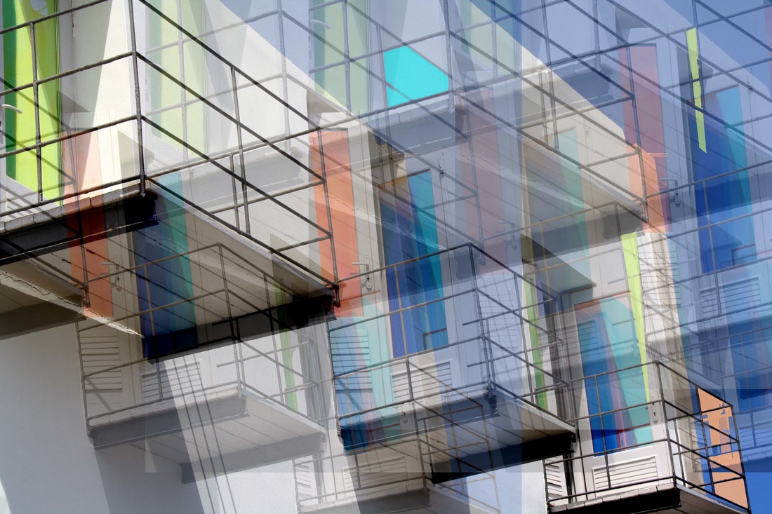
Putting these 2 photographs together shows their common themes. To make the similarities greater I will edit by adding more shapes in the pastel colour theme.
|
|
Refining my ideas - an alternative
My most successful photographs

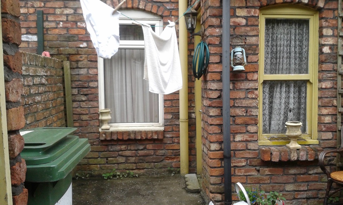

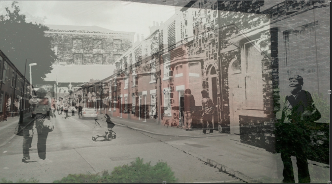
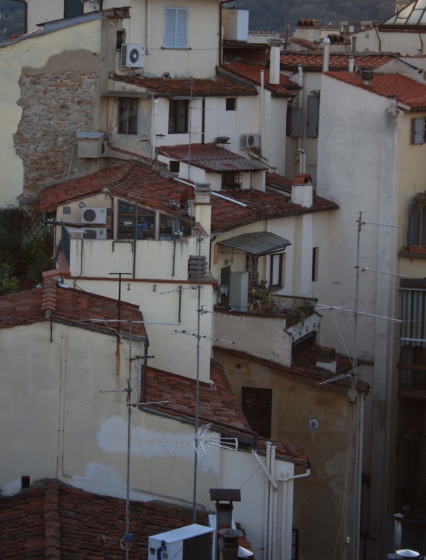
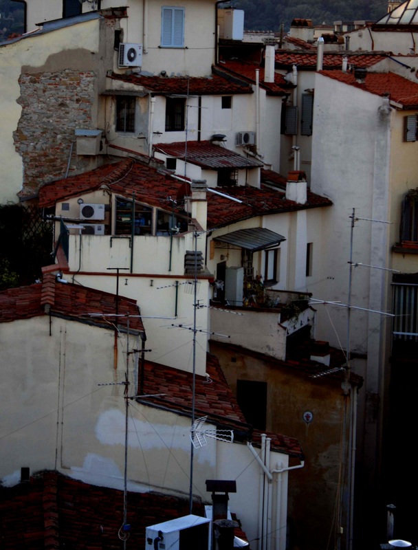
By selecting these photographs I am starting to see the links between them and will use this as my inspiration to develop a final piece. I am interested in exploring the history of a place looking closely at how history ties in with the present day. What stories might a place have from the past?
exploring my ideas using photoshop techniques

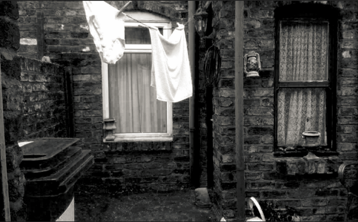
I selected the area I wanted to keep in colour and copied it as a layer, I adjusted the saturation to make it appear brighter. I then made the background black and white and enhanced the textures to make the black and white appear older. I wanted to contrast old with new, present with past. I think that it is a visually appealing photograph that shows my intention.
I added more depth by increasing the contrast to age my photograph and bring out all of the textures in the image.
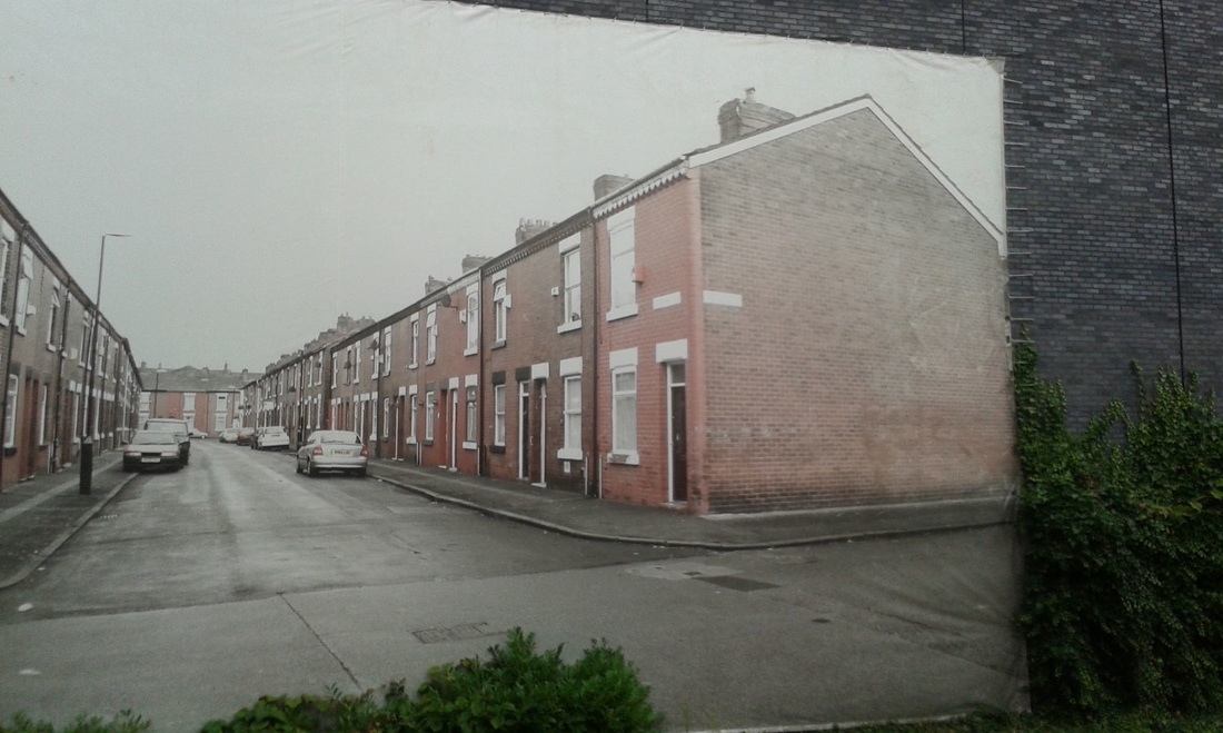
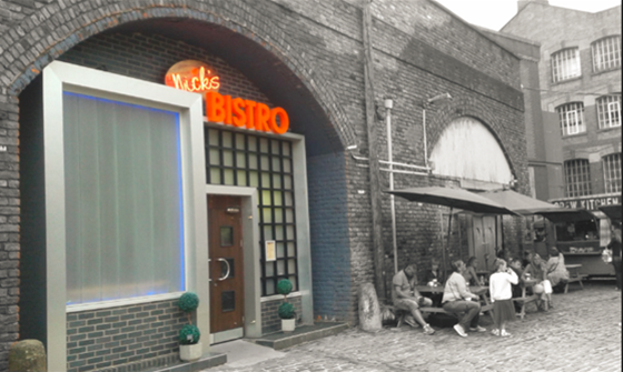
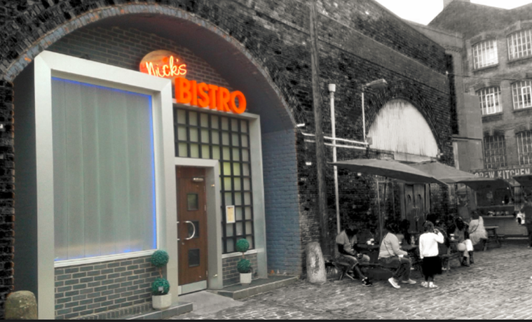
creating an illusion
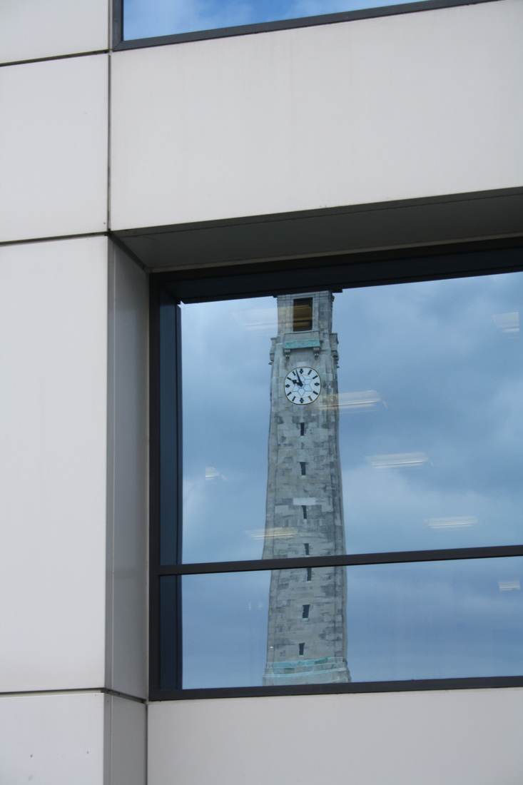
I particularly like this photograph because it is a photo attached to a wall to create an illusion when you look at it through a bridge. I want to use this same photograph to create my own illusions on Photoshop.


I combined these two photographs to create an illusion, the overall effect is that it adds more distance.
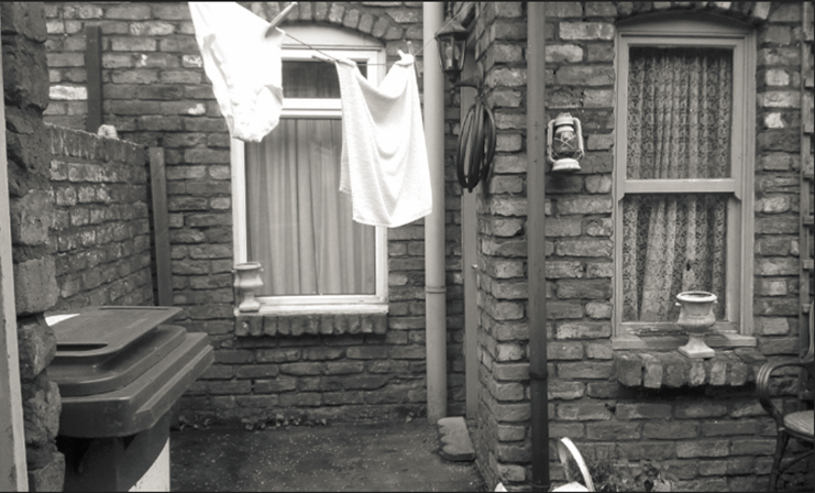
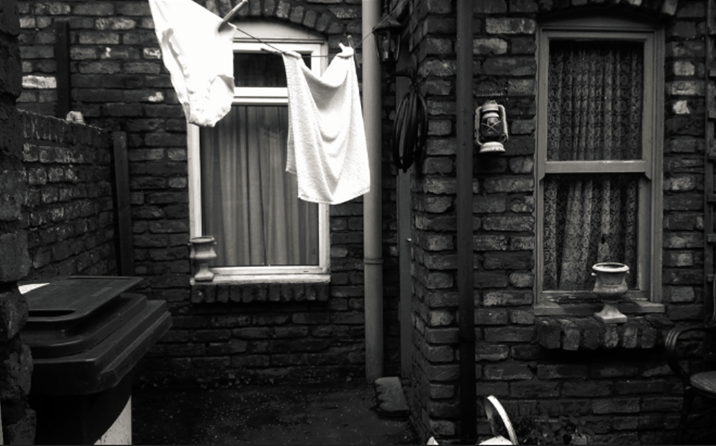
Developing a final piece
By placing these two photographs together I wanted to show how aging can be beautiful when textures become more prominent. I believe the older something becomes the more interesting it is as it has more stories to tell. I used the same images together to show aging over time. You can clearly see a reflection in the foreground that looks like a window, this places the viewer as the observer.