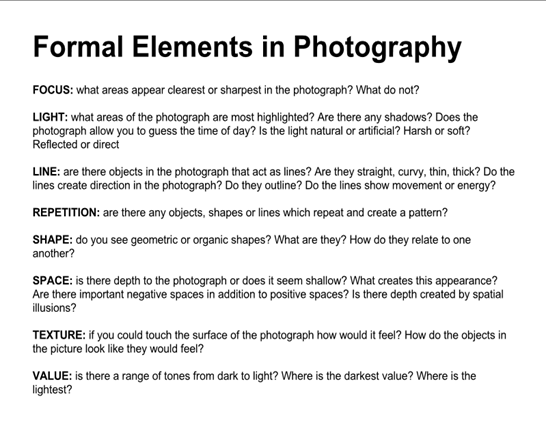
Creating a great photograph can take less that a second or a lifetime. Many of the most famous and influential photographers are successful because they instinctively use these formal elements to create the best photograph they can whilst in front of the camera. This can be because the compose image with precision or that they recognise the perfect moment to press the shutter.
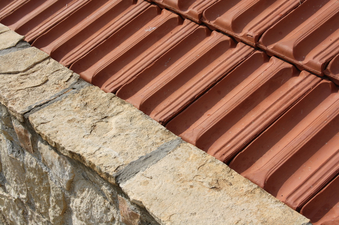
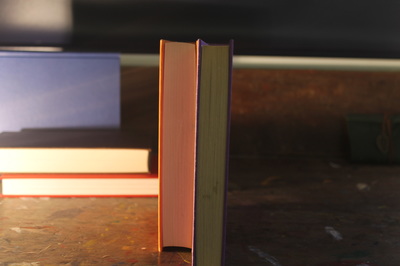
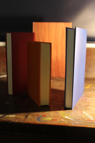
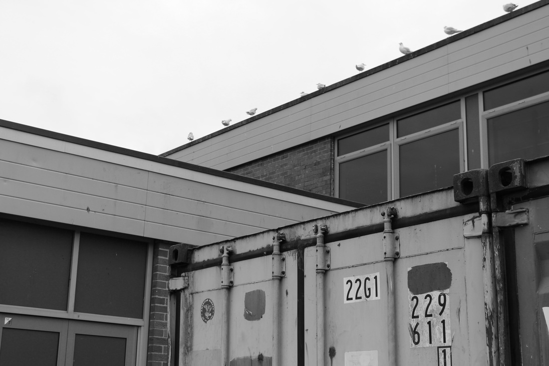
Line


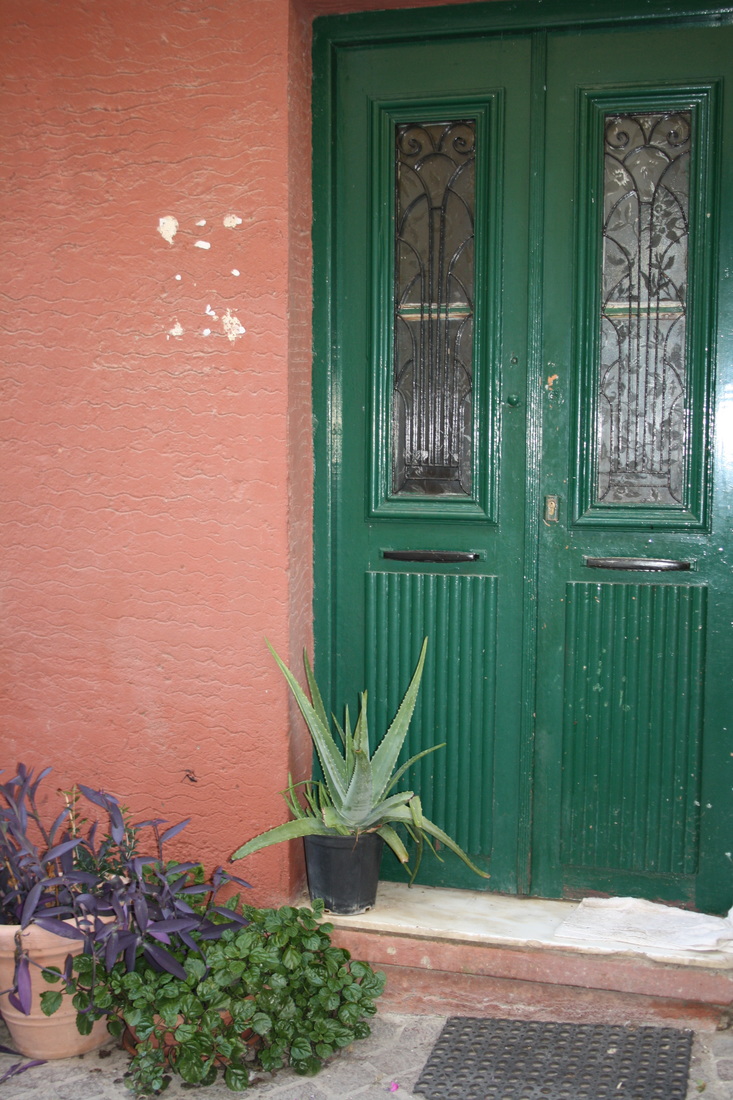
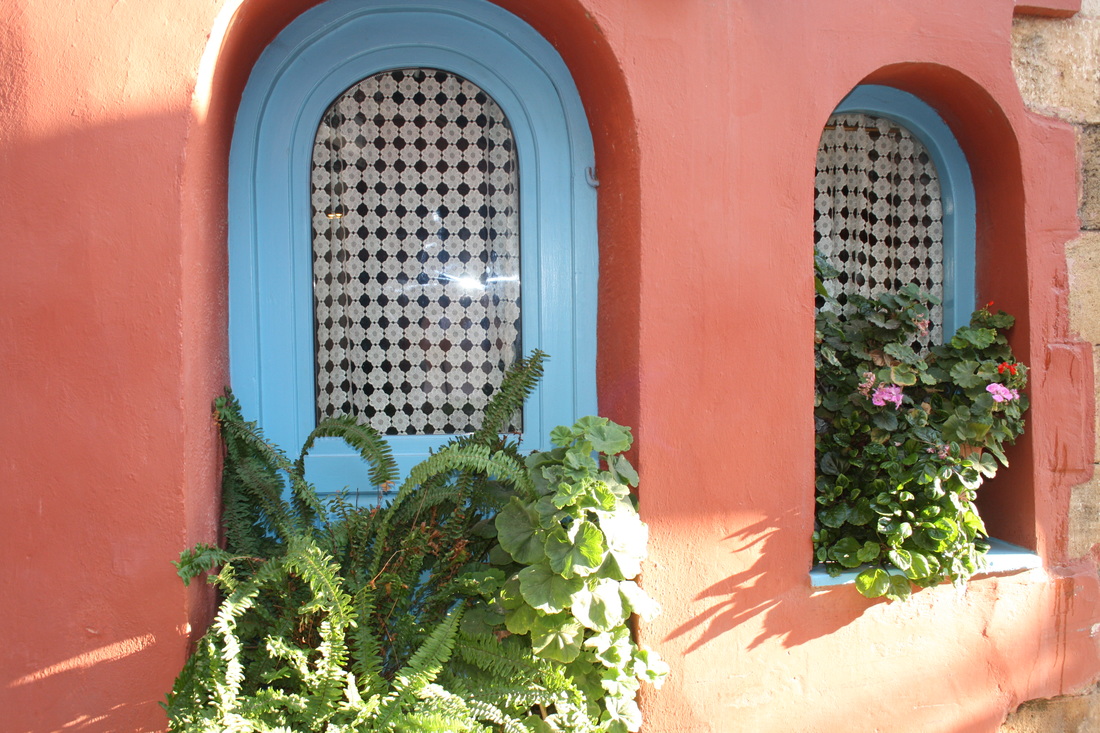
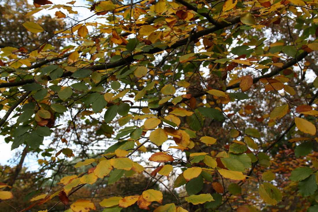
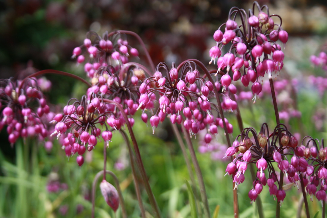
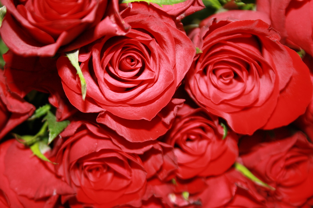
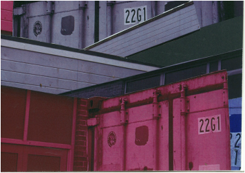
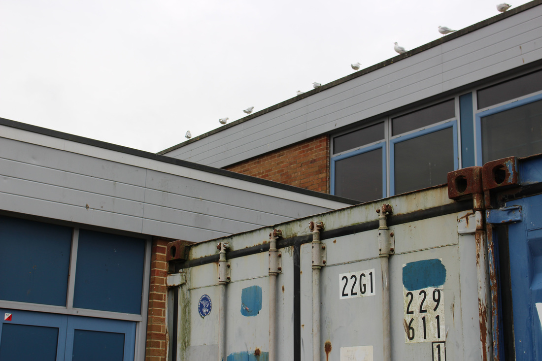
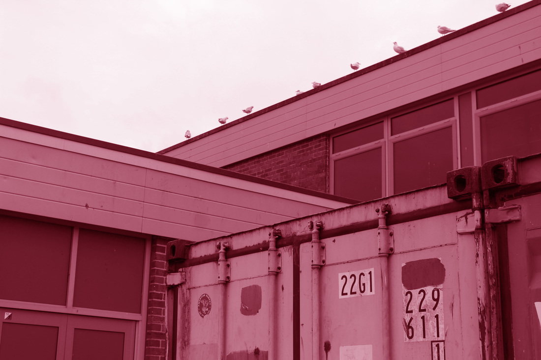
Colour

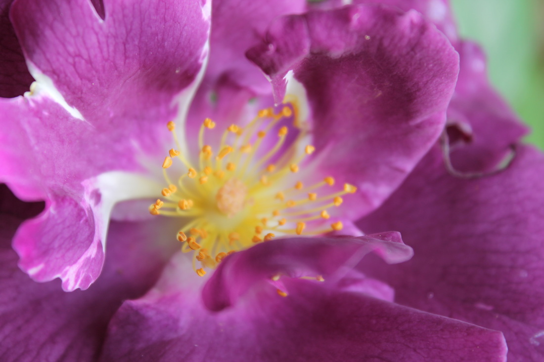


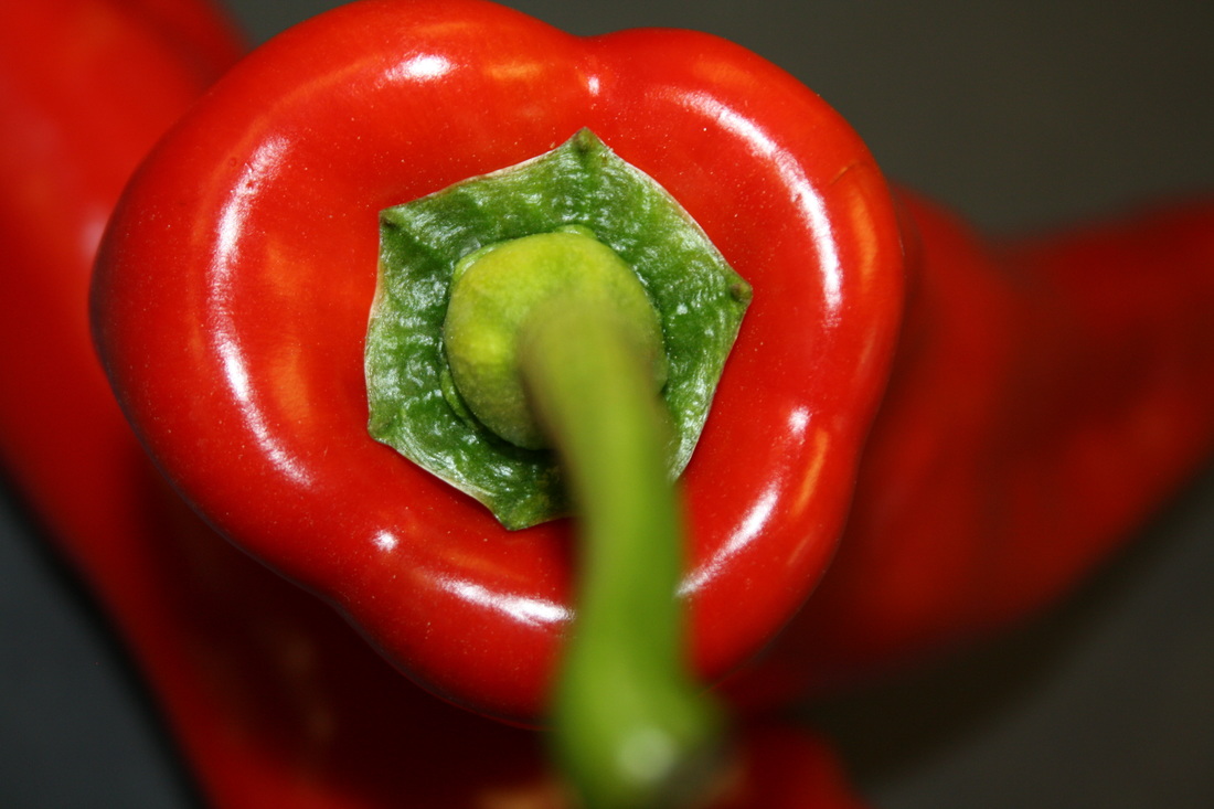


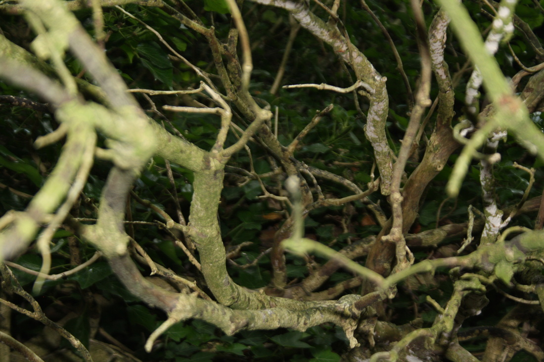
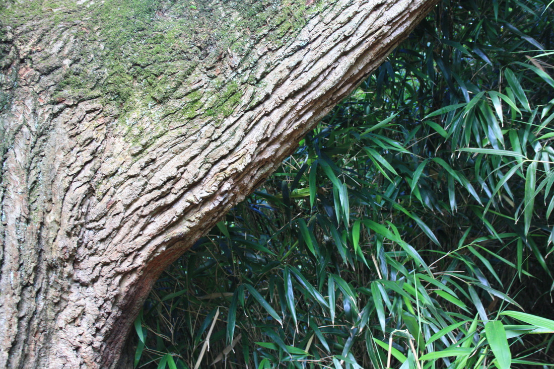
texture


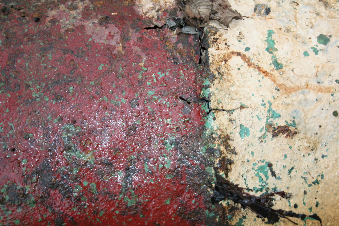

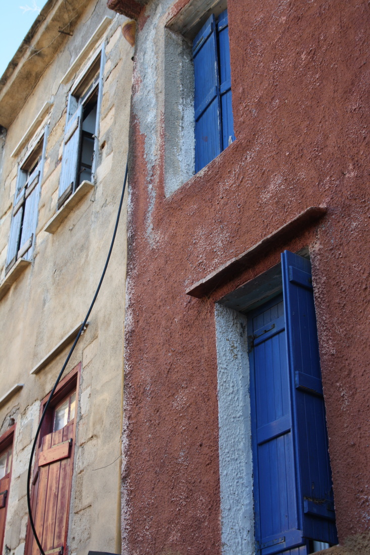
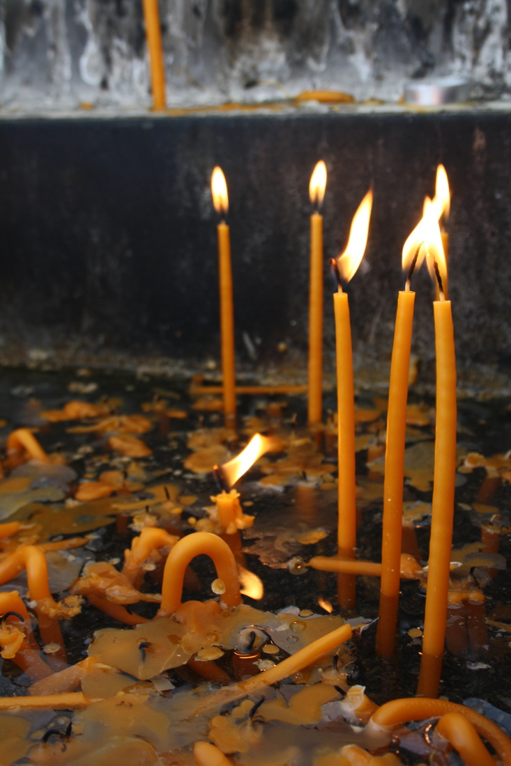
Value and light
andreas feininger.
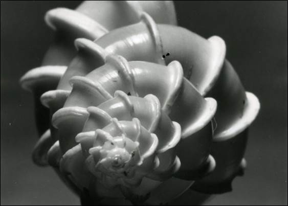
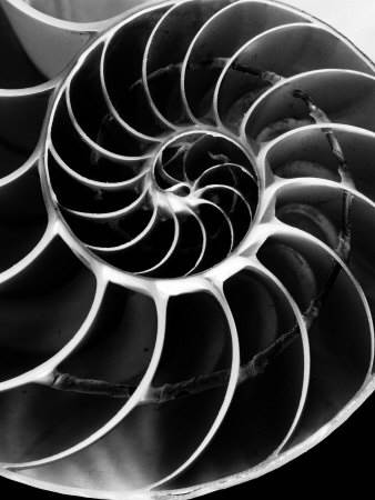

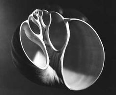
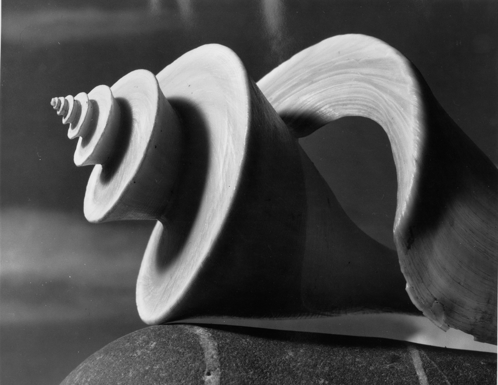
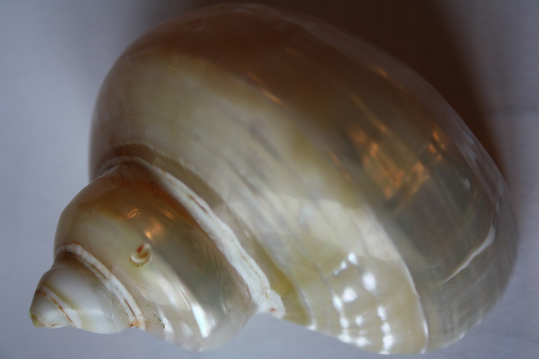
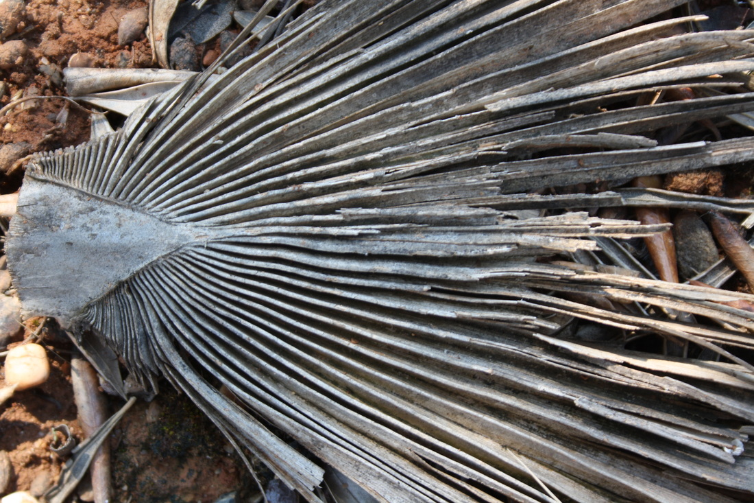
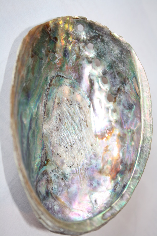
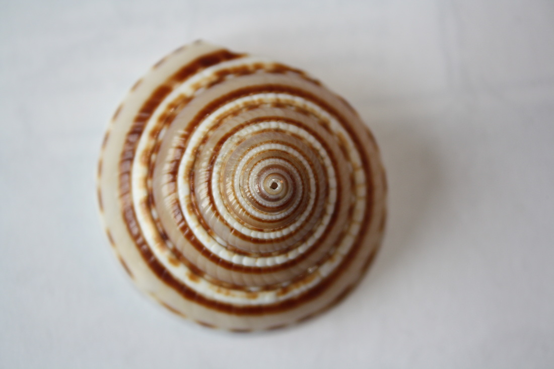
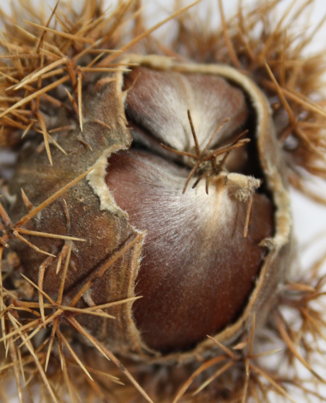
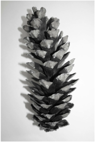
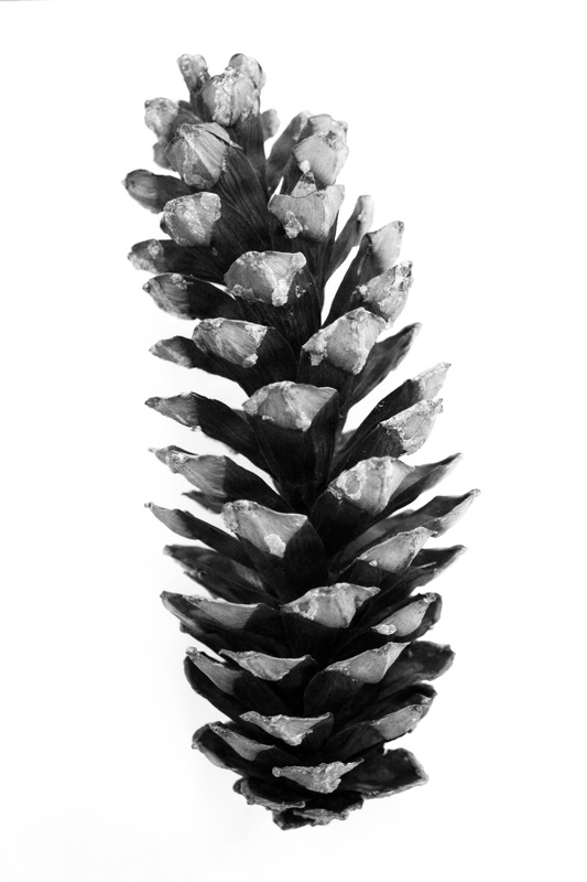
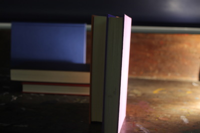
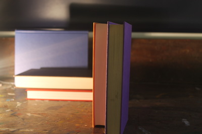
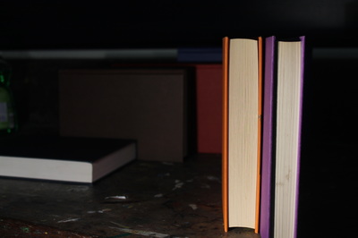
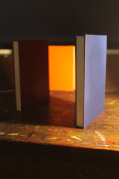
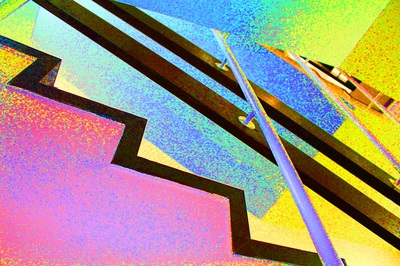
Andreas Feininger's photographs of nature captured the beauty of the delicate forms. He used monochrome with high contrast to emphasise the structures and shapes of the objects. He made abstract shapes by magnifying sections of shells and tree bark.
His photographs were highly controlled and he used lighting to create shadows and highlights. Using many tones he drew attention to the form of the objects.
I particularly like the spirals which he emphasised using strong contrasts. I will use this way of closing in on the structures and using strong lighting in my own photography.
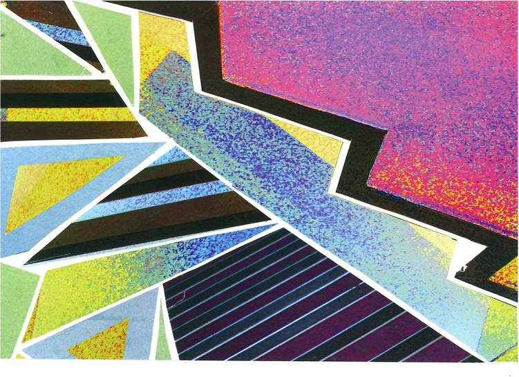
my response to feininger


refining my response to feininger
|
|
|
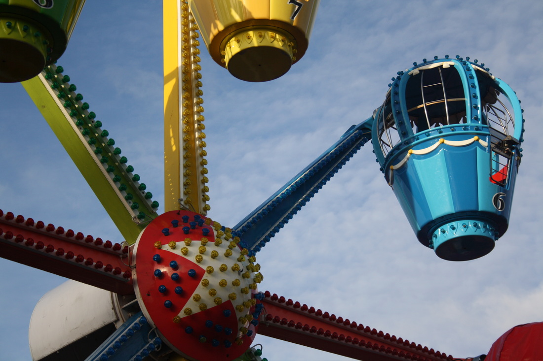
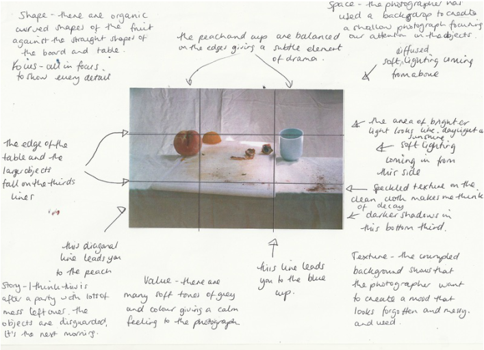
Shape and focus
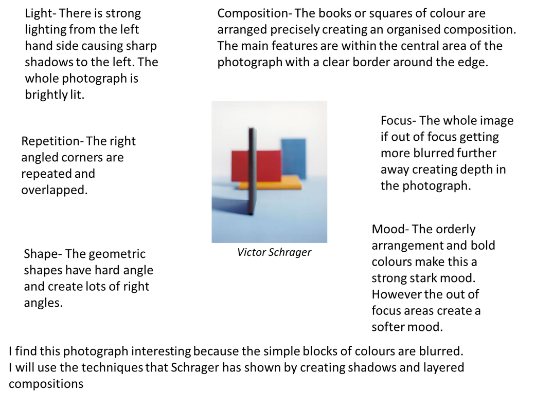
victor schrager

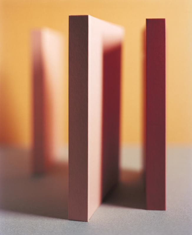
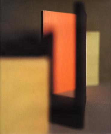
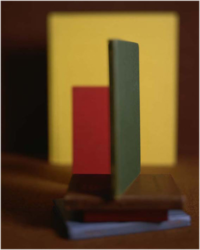

analysing a schrager photograph
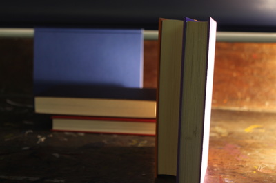
my response to schrager


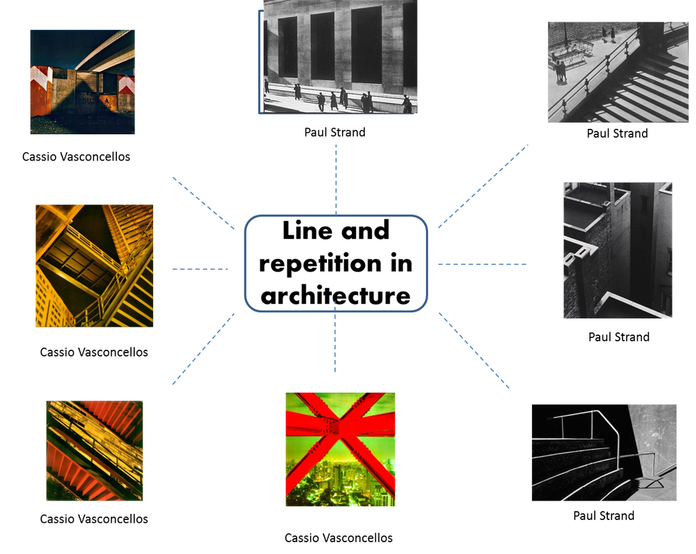
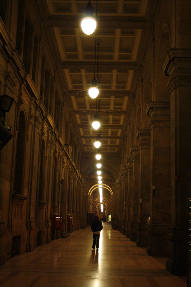
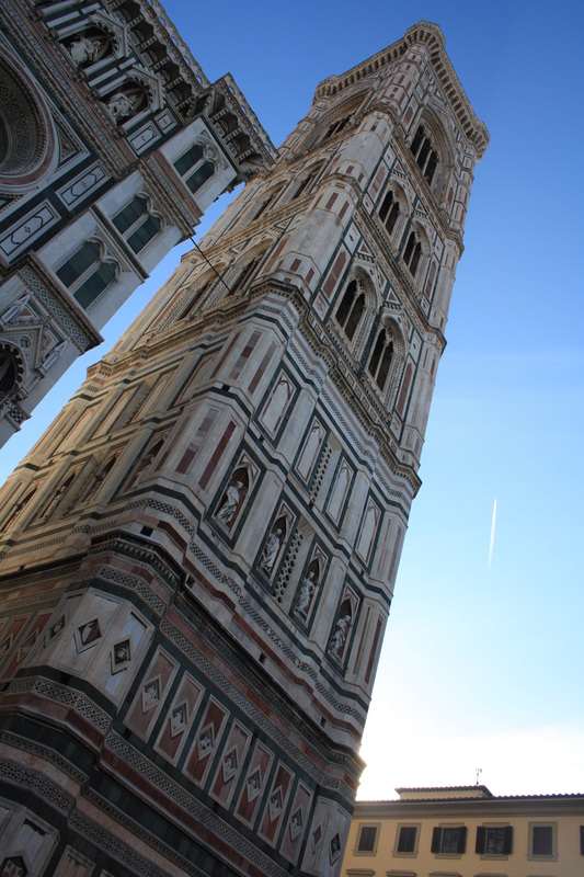
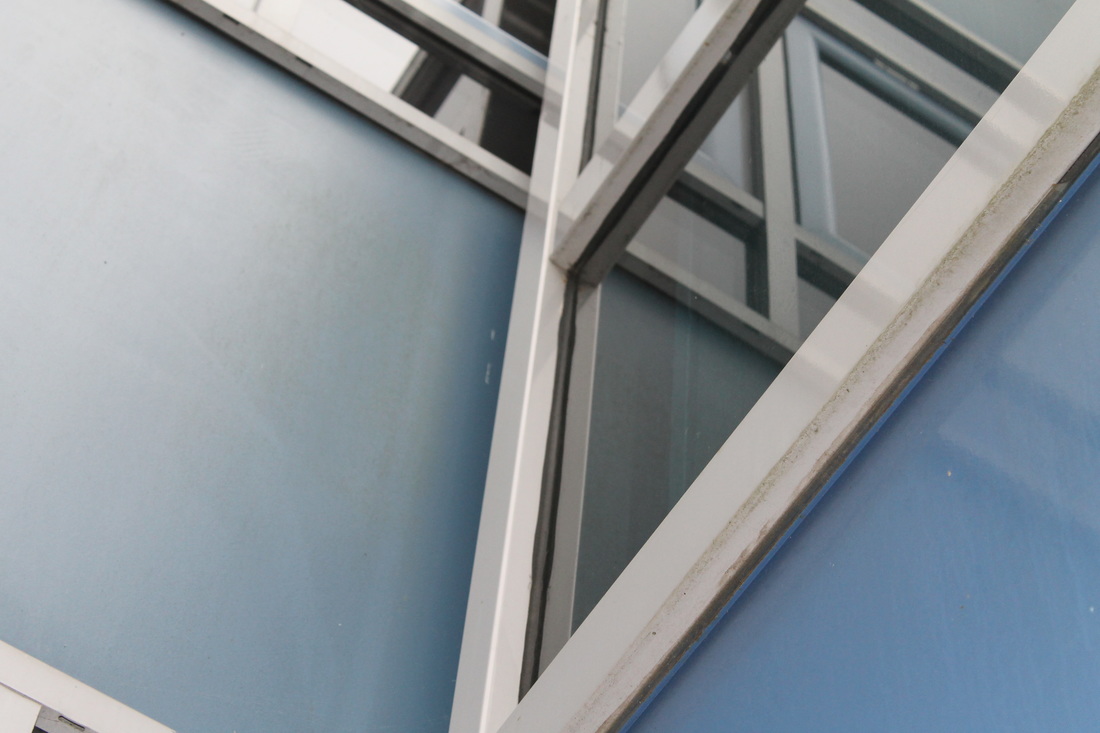
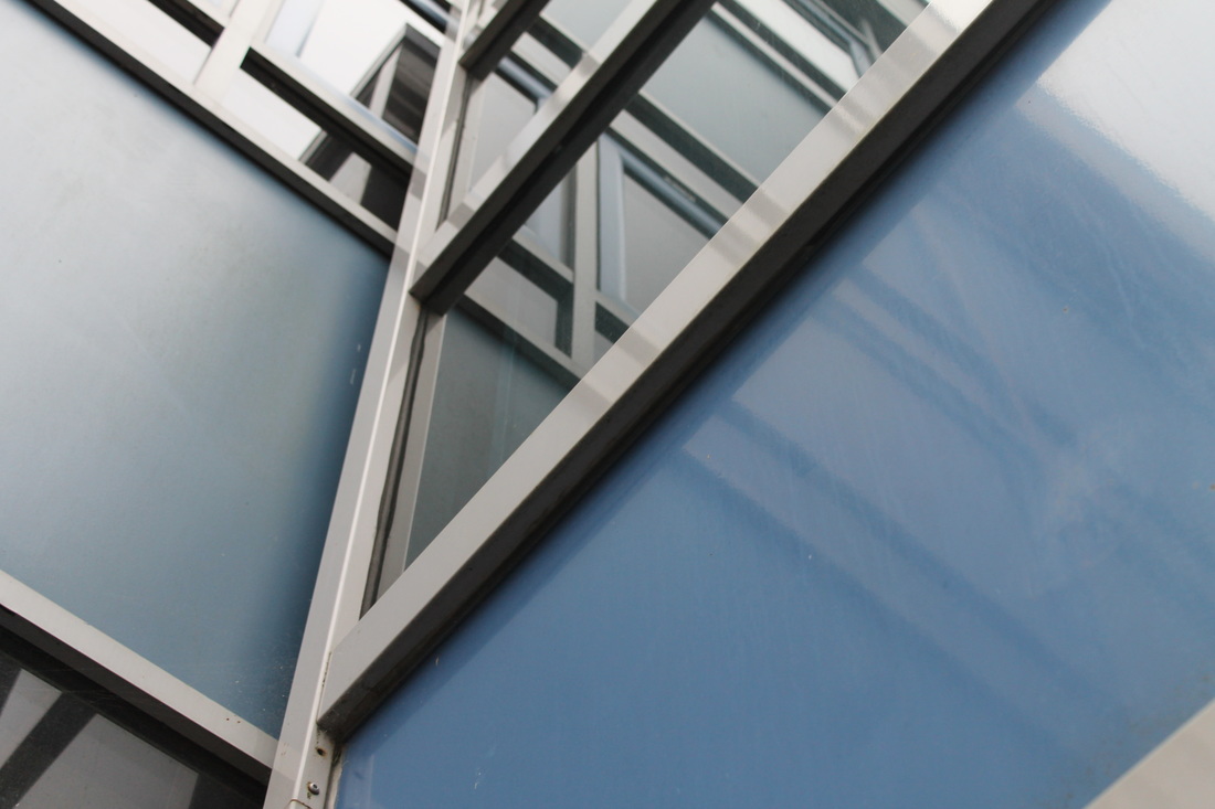
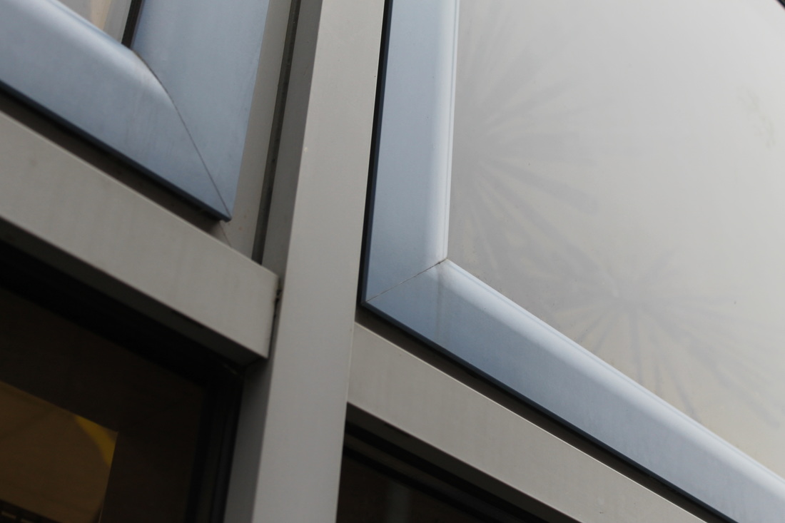
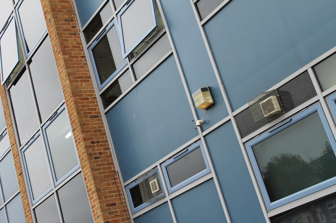
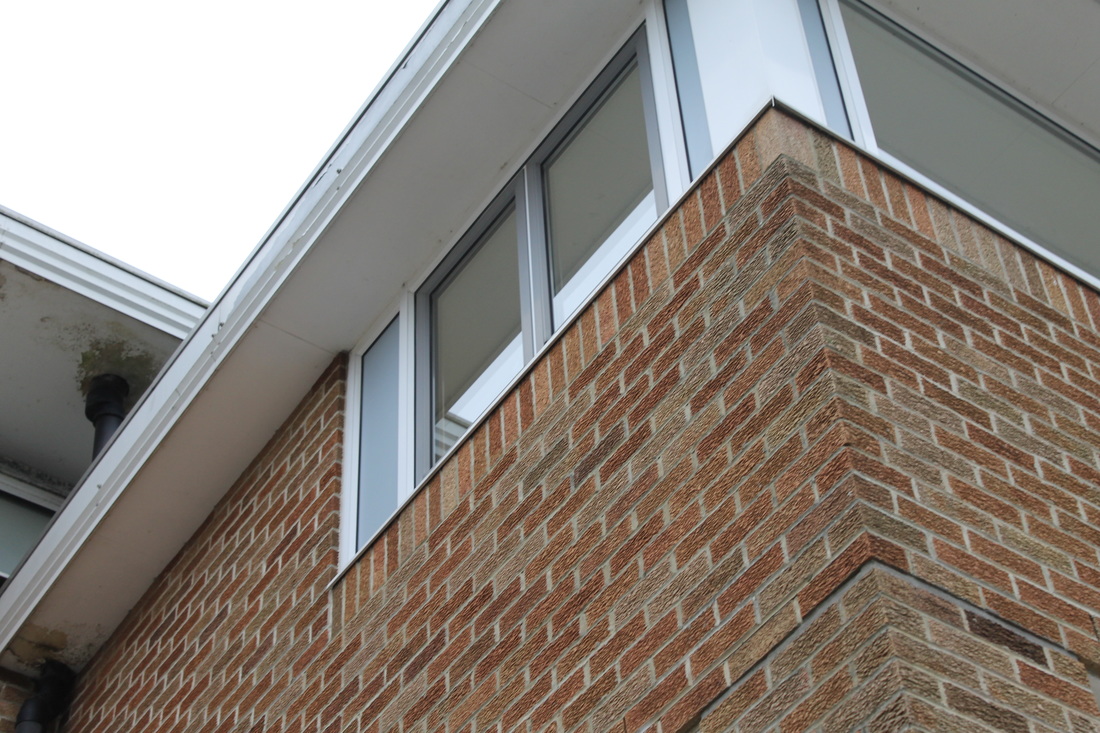
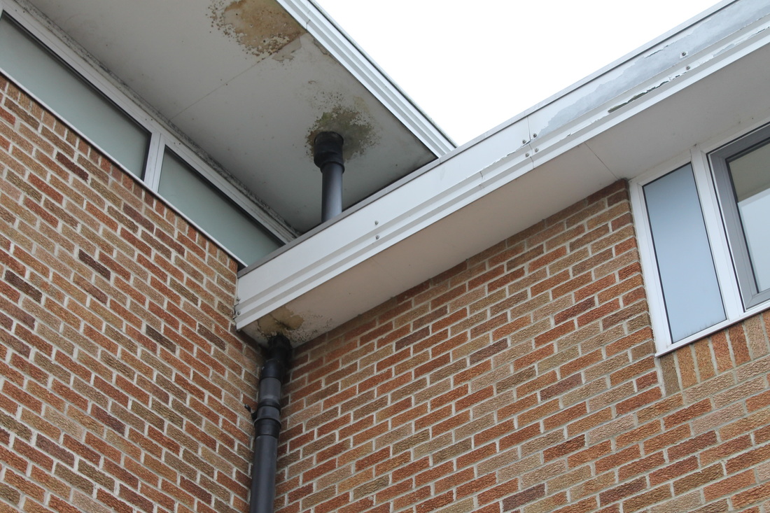
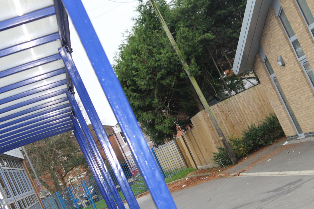
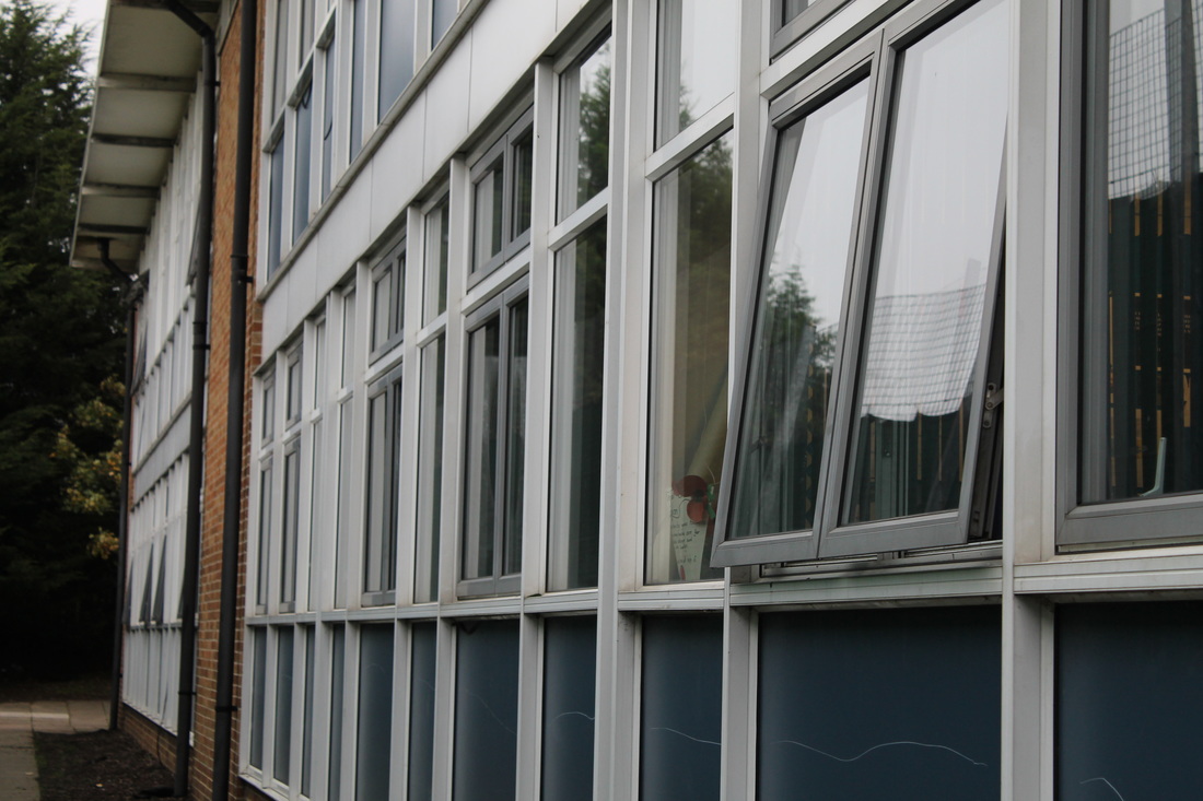
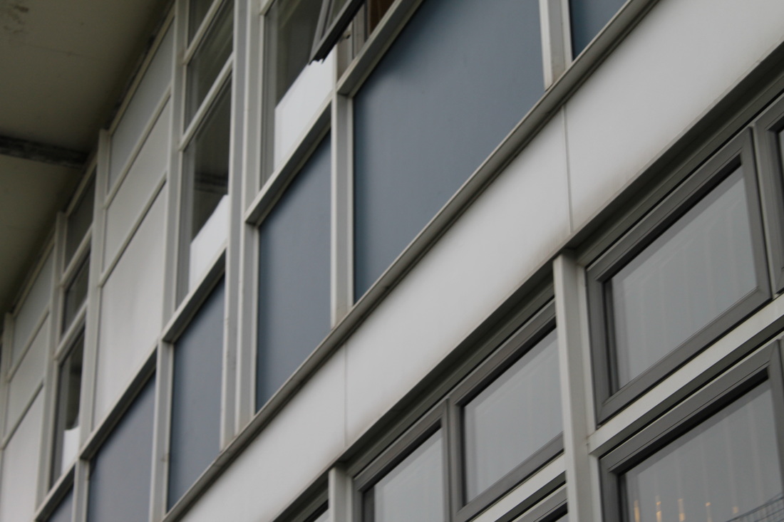
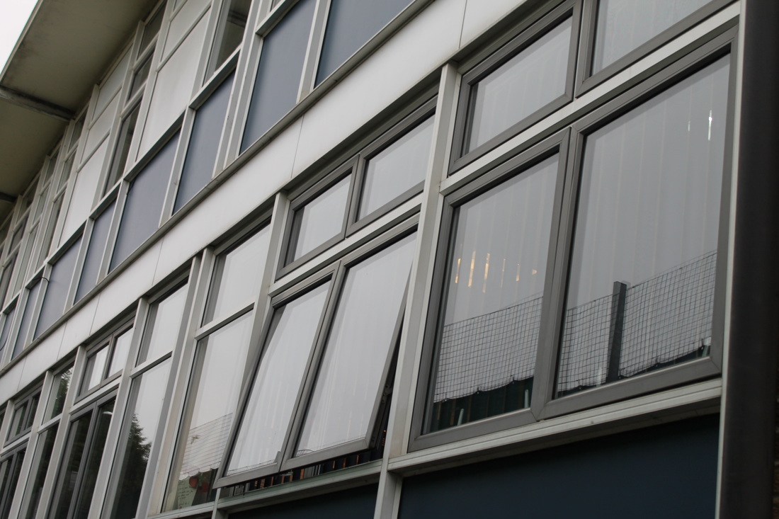
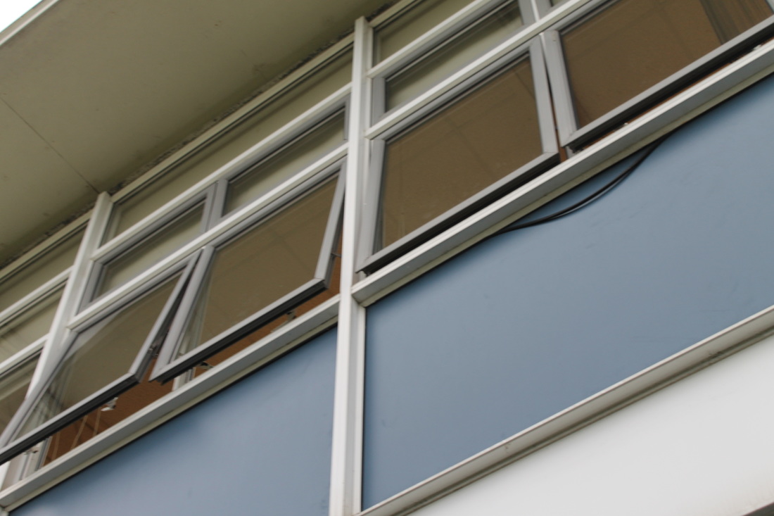
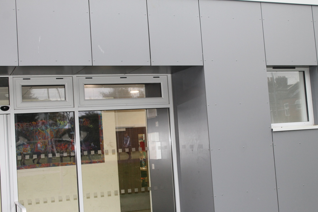
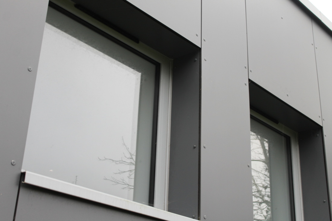
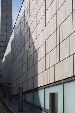
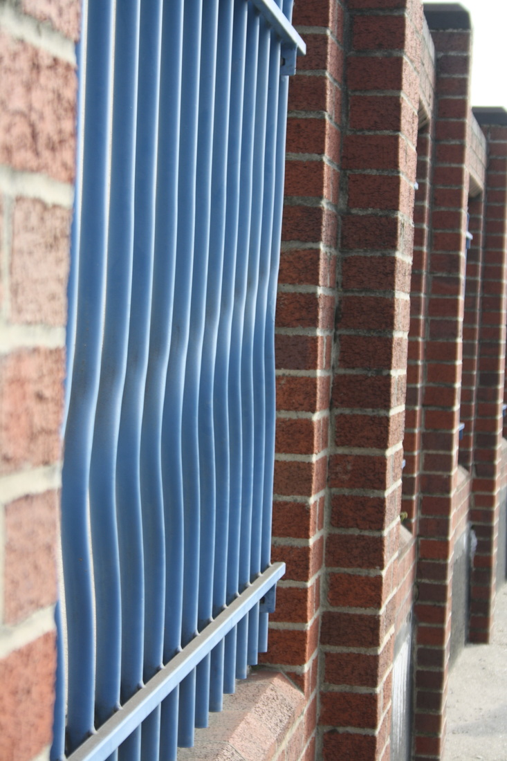
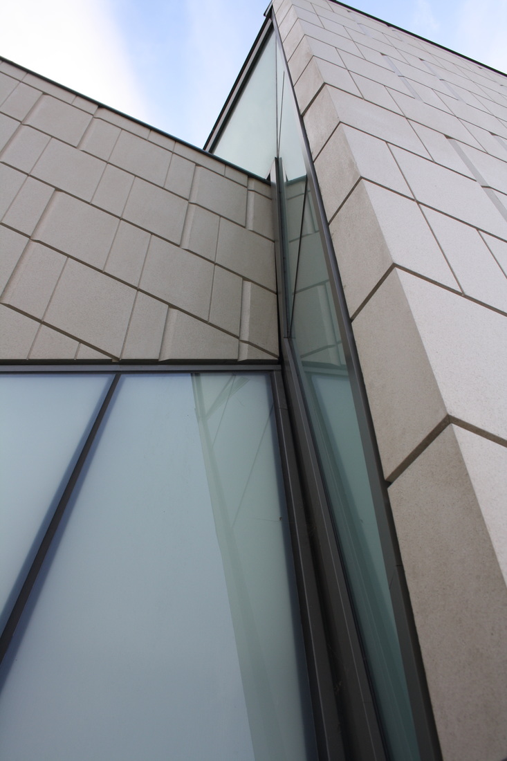
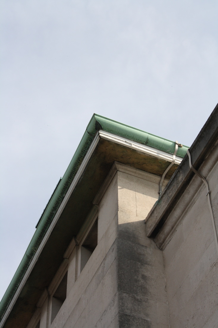
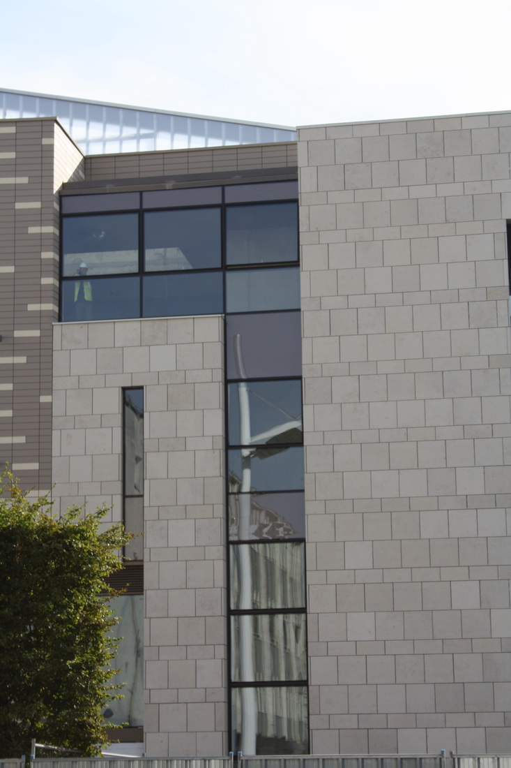
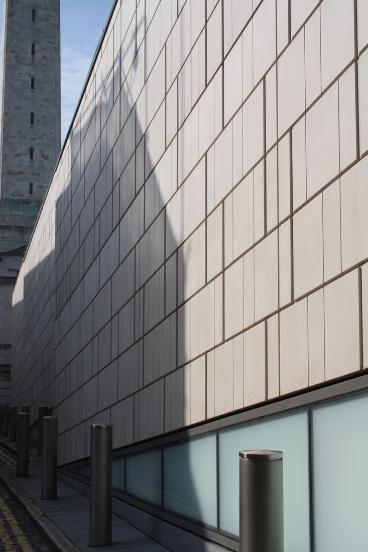
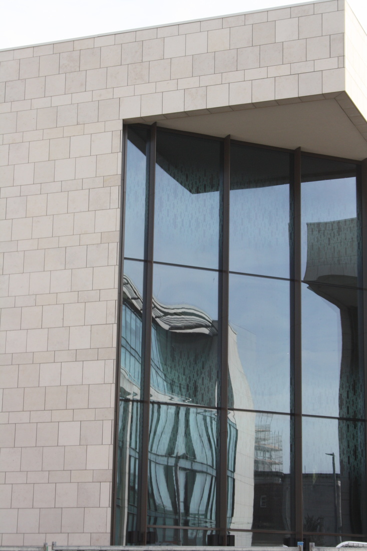
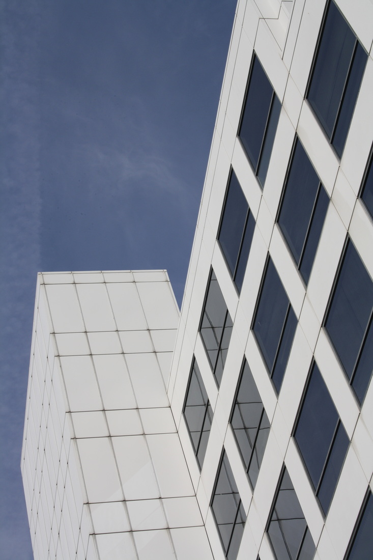
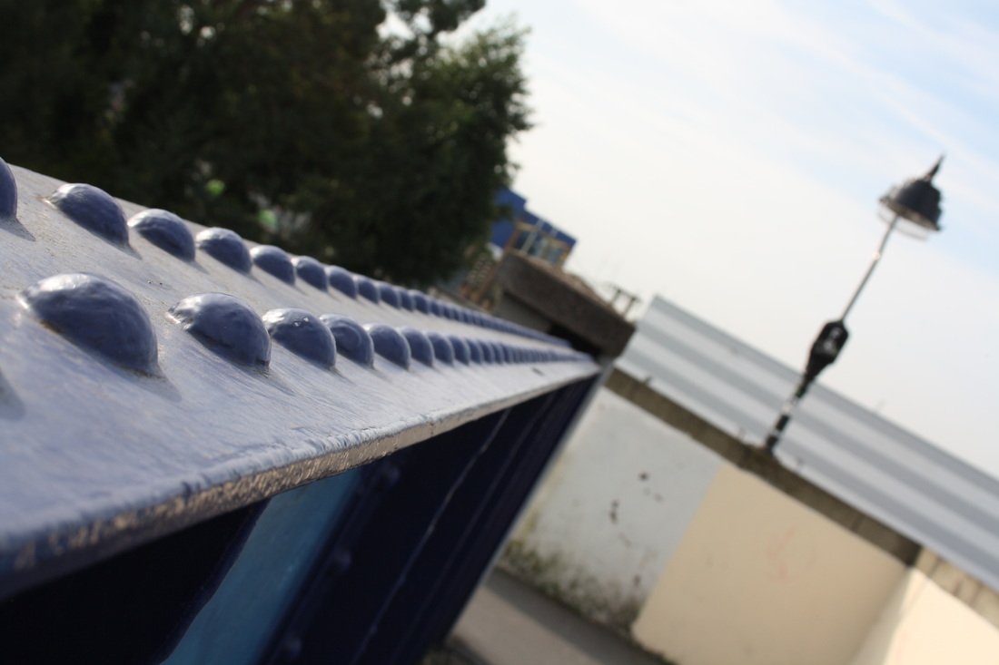
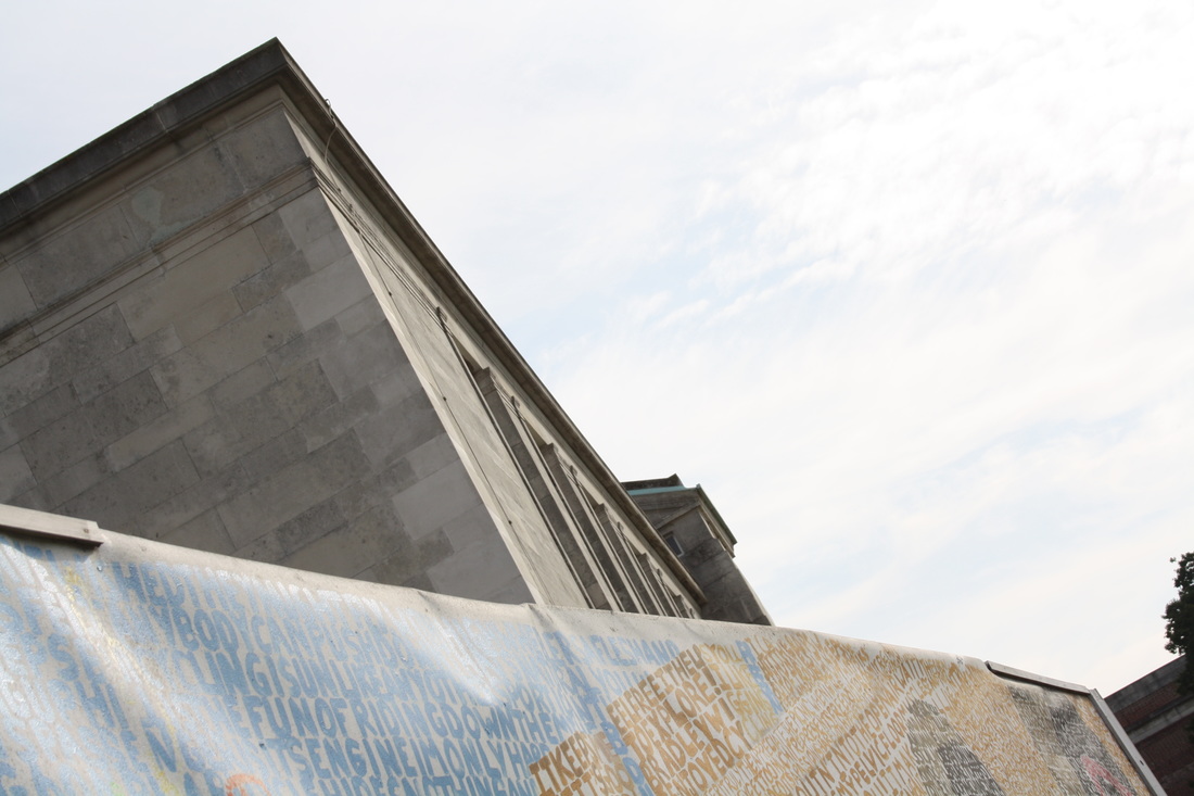
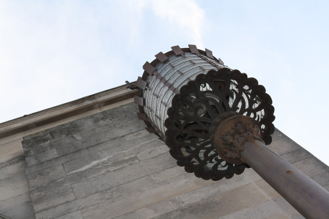
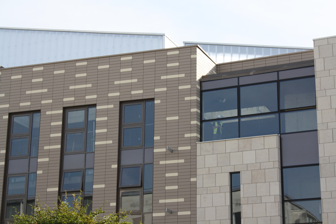
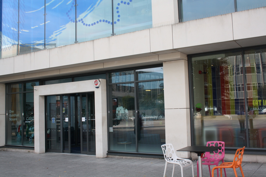
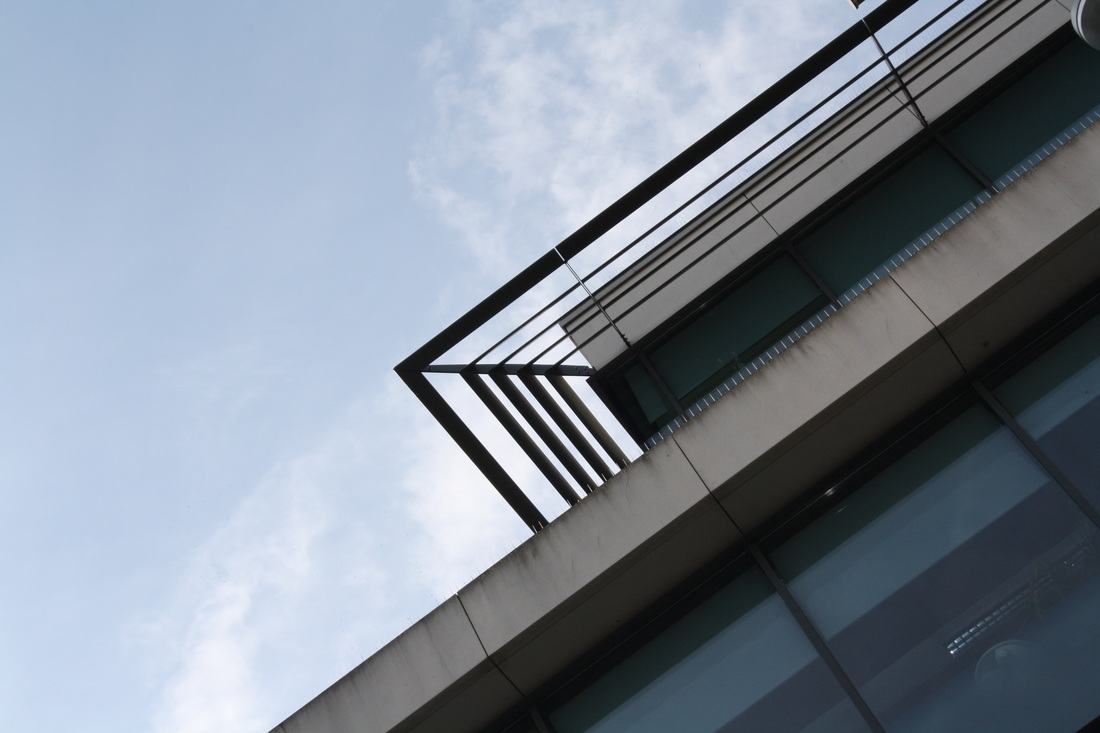
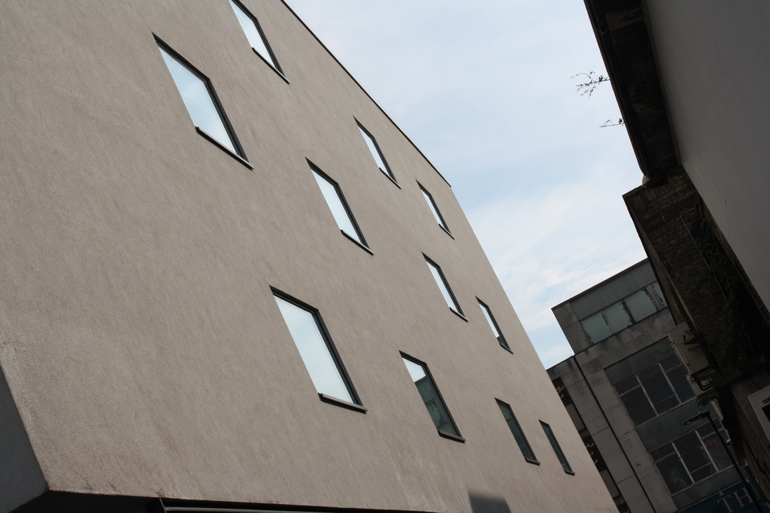
view points in architecture

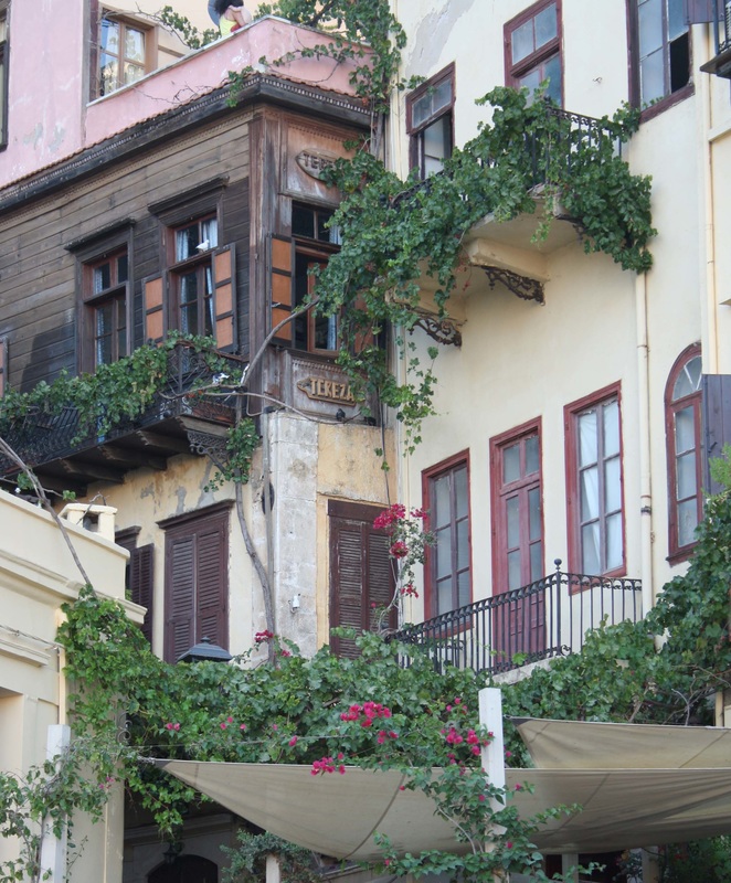
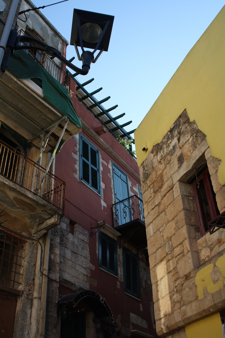


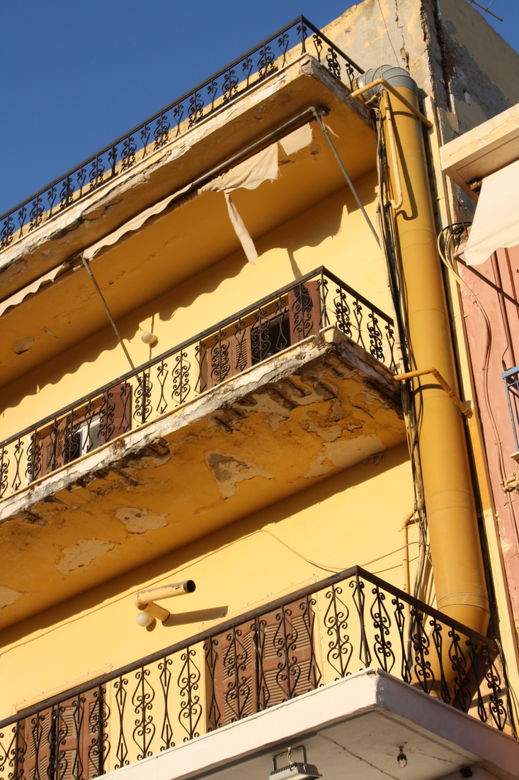
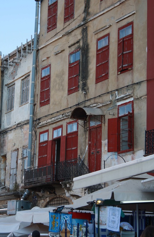
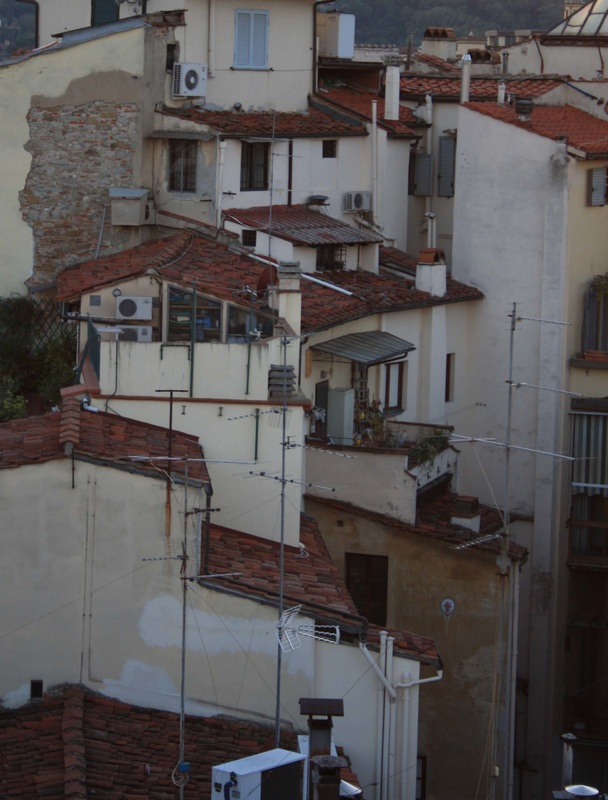
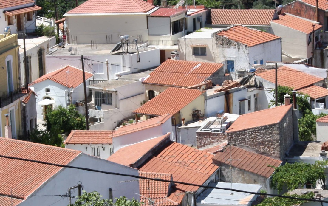

line and repetition in architecture


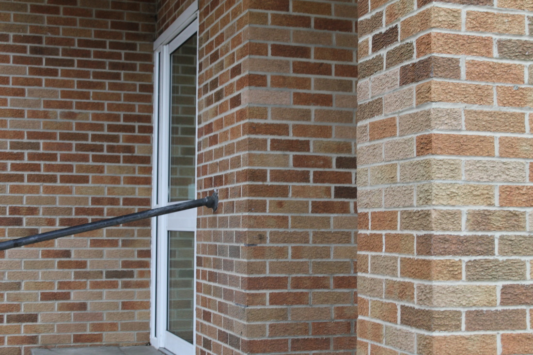
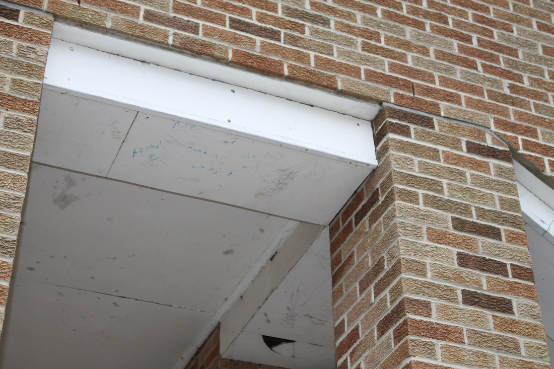
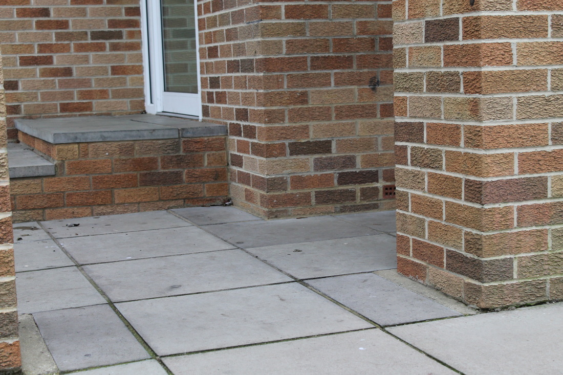
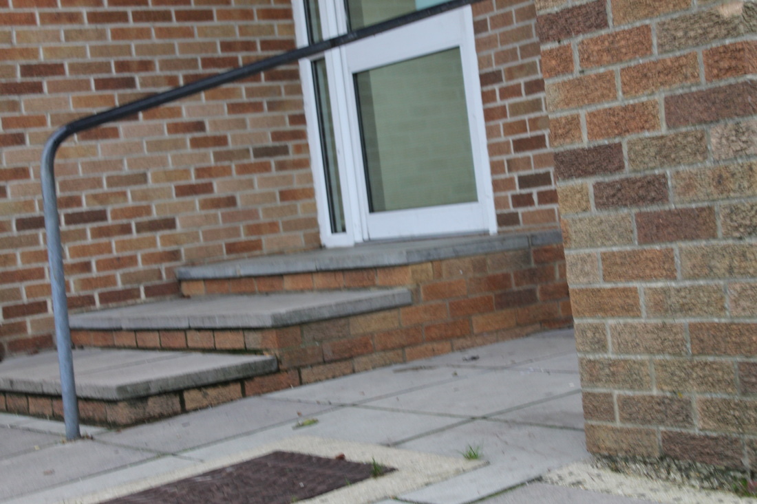
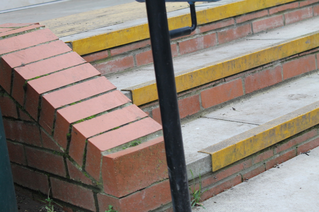
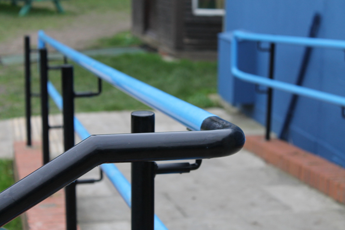
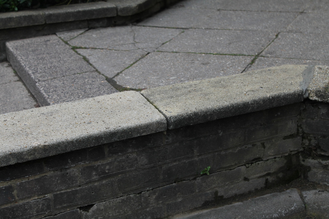
paul strand
|
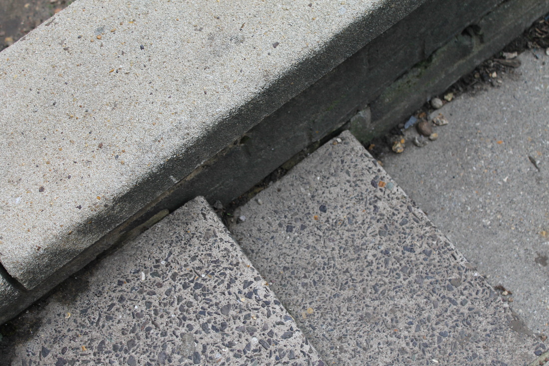
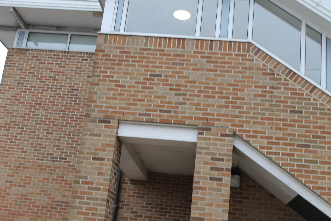
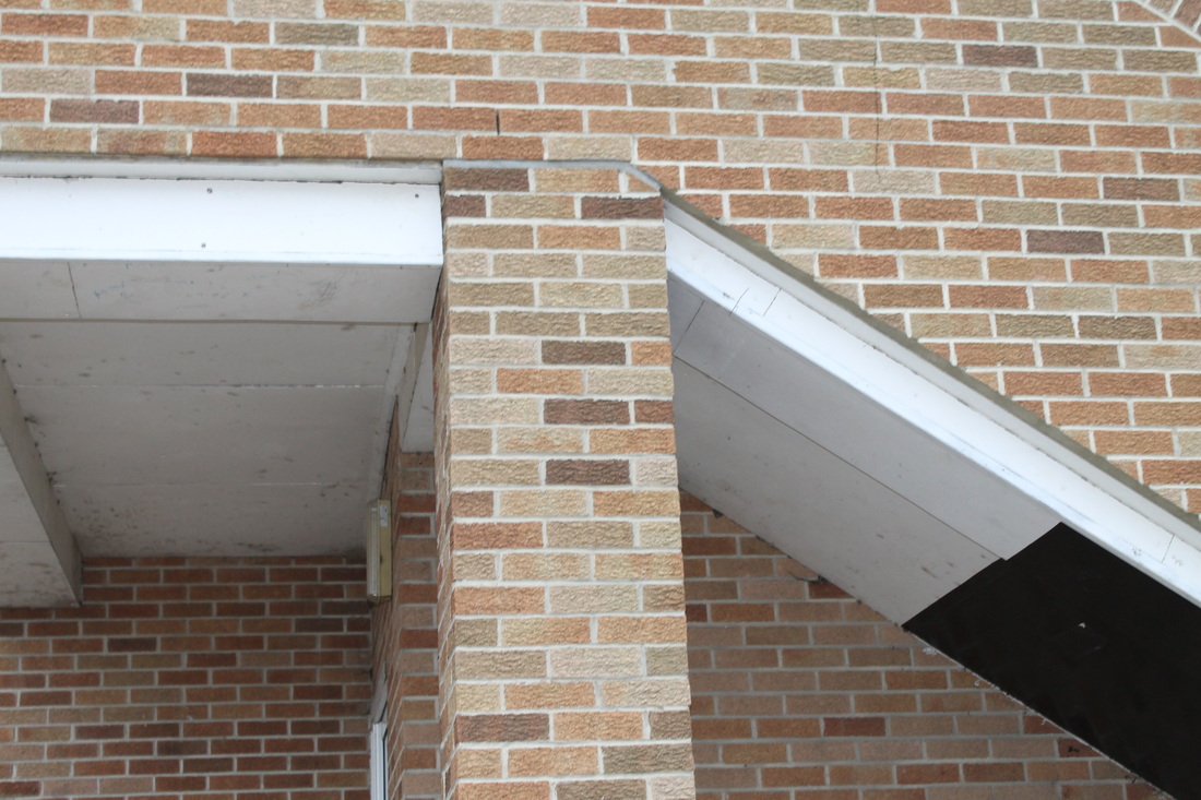
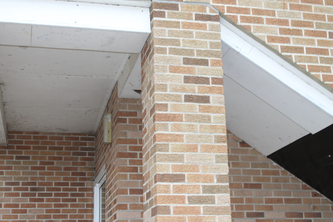
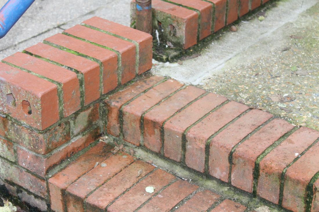
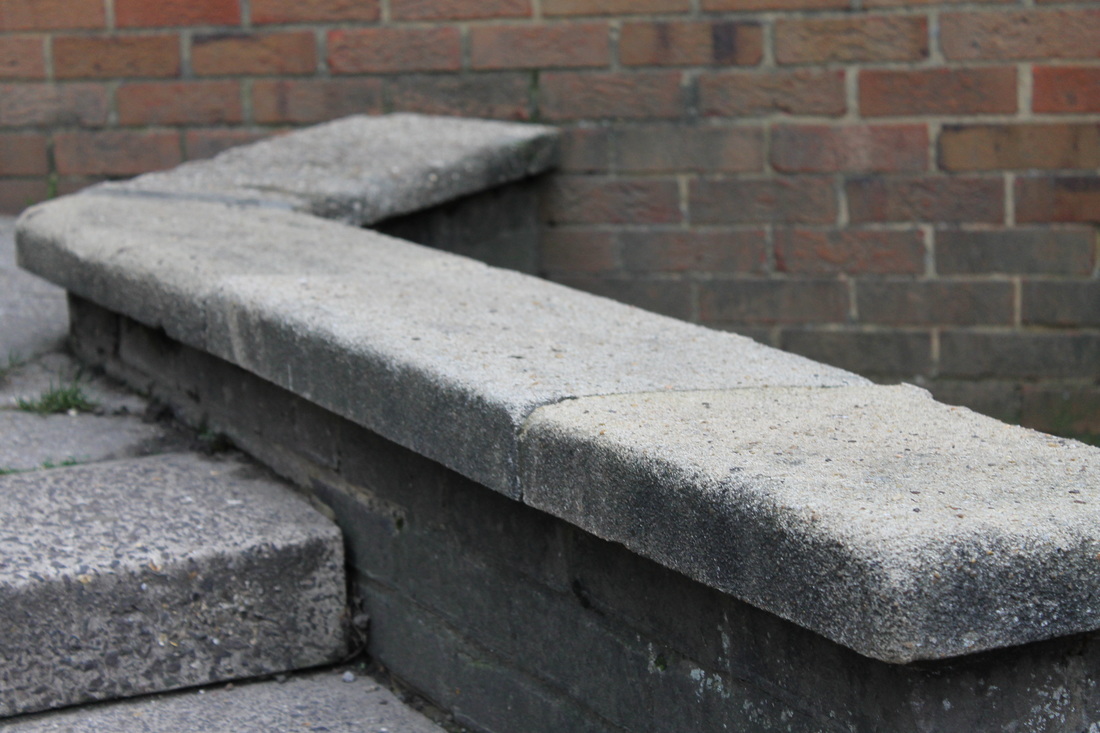
Paul Strand’s photographs of architecture captured the strength and structures in the city environment. He used monochrome with high contrast to emphasise the lines and shapes of the buildings. He noticed the shapes formed by the shadows and highlights and based his composition around these features
I particularly like the shapes in stairways which he emphasised using strong contrasts. I will use this way of closing in on the structures in my own photography. |
|
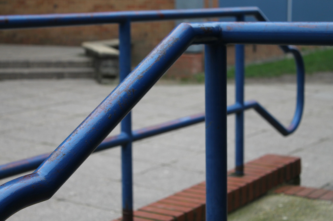
analysing a paul strand photograph
my response to paul strand
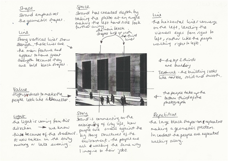
I chose this photograph because it has clear repeated shapes and the lines lead your eye into the distance. The rule of third lines divide this image with vertical uprights.
|
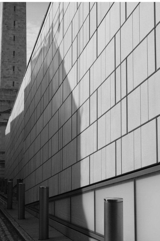
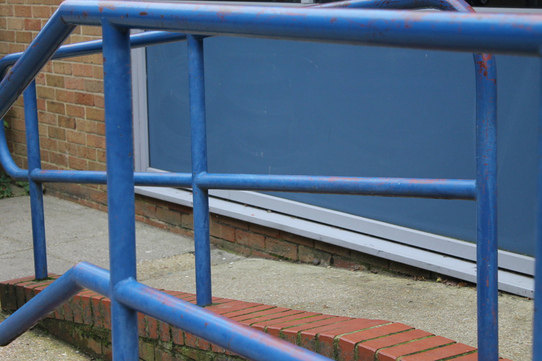
First I changed the photograph to black and white to show the link with Strand.
|
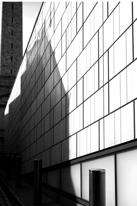
I increased the contrast using the levels tool on photoshop. This made the shadow area very dark rather like some of Strands images.
|
|
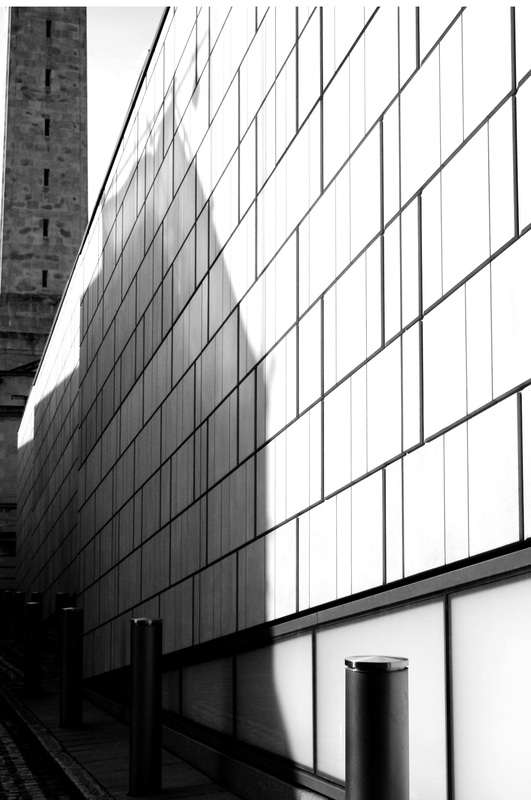
Using the curves tool on photoshop, I lightened the shadow area whilst keeping the contrast quite high. I am pleased with the way I have used shape, patterns and composition in this photograph. There is a clear link to the work of Paul Strand because of the high contrast and similar composition. If I took this photo again I would include a figure in the distance to give the image scale, showing how small humans are in the urban environment.
|
|
cassio vasconcellos

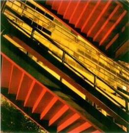
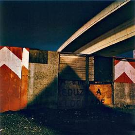
analysing a photograph by Cassio vasconcellos
|
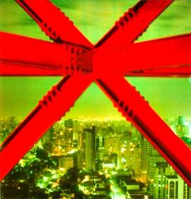
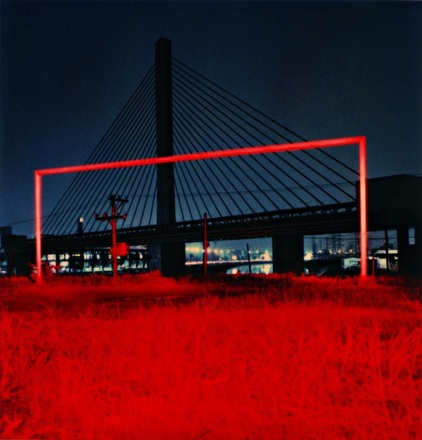
This is my favourite photograph by Cassio Vasconcellos. The way he has used colour is particularly striking. By emphasising the complementary colours of red and green he has made the structures of the bridge stand out against the green background. He has created depth in the photograph by including buildings that are far away which gives the image a sense of scale. This photograph was taken a night as the buildings are lit up giving the bottom of the photograph a bright glow. The lines of the bridge structure give the photograph a dynamic mood. I think this tells a story of the industrial city living, with human existence being dominated by the iron and steel of large constructions.
I will try to use Vasconcellos' techniques of having a limited colour palette to emphasise shape in my own photography. |
|
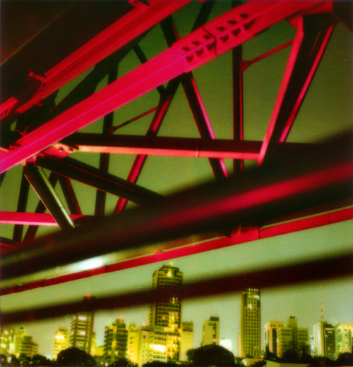
This is my favourite photograph taken by Cassio Vasconcellos. I really like the colour scheme and how he inhabited a really bold colour such as red in this night life image; it creates a pop of colour, eliminating this image from being just another simple night fall photograph, also the city lights in the background harmonise nicely with the red. I also love how the triangle shaped structure lines up with the red frame as it makes that area look full up and dynamic. I like the way Vasconcellos made the background look full (with the city) and left the rest of the image simplistic (besides the use of the blood red colour).I really enjoy Cassio Vasconcellos' work as I think his photographs look really intriguing and I love how he tends to use a bold pop of colour in most of his images.
|
my response to cassio vasconcellos.


using collage.
|
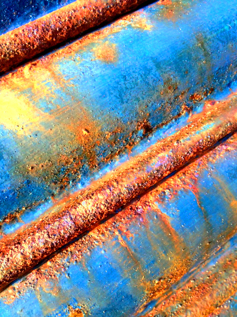
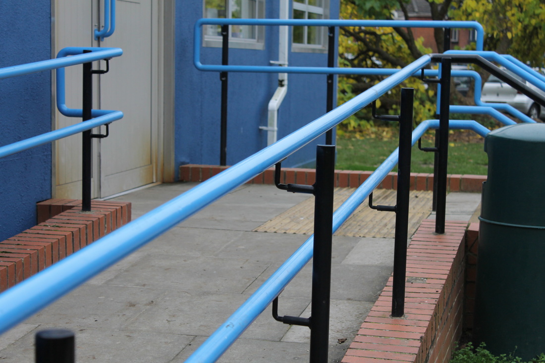
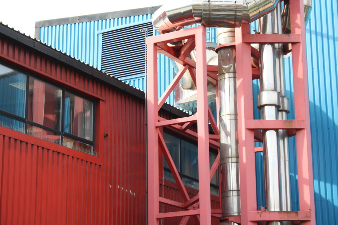
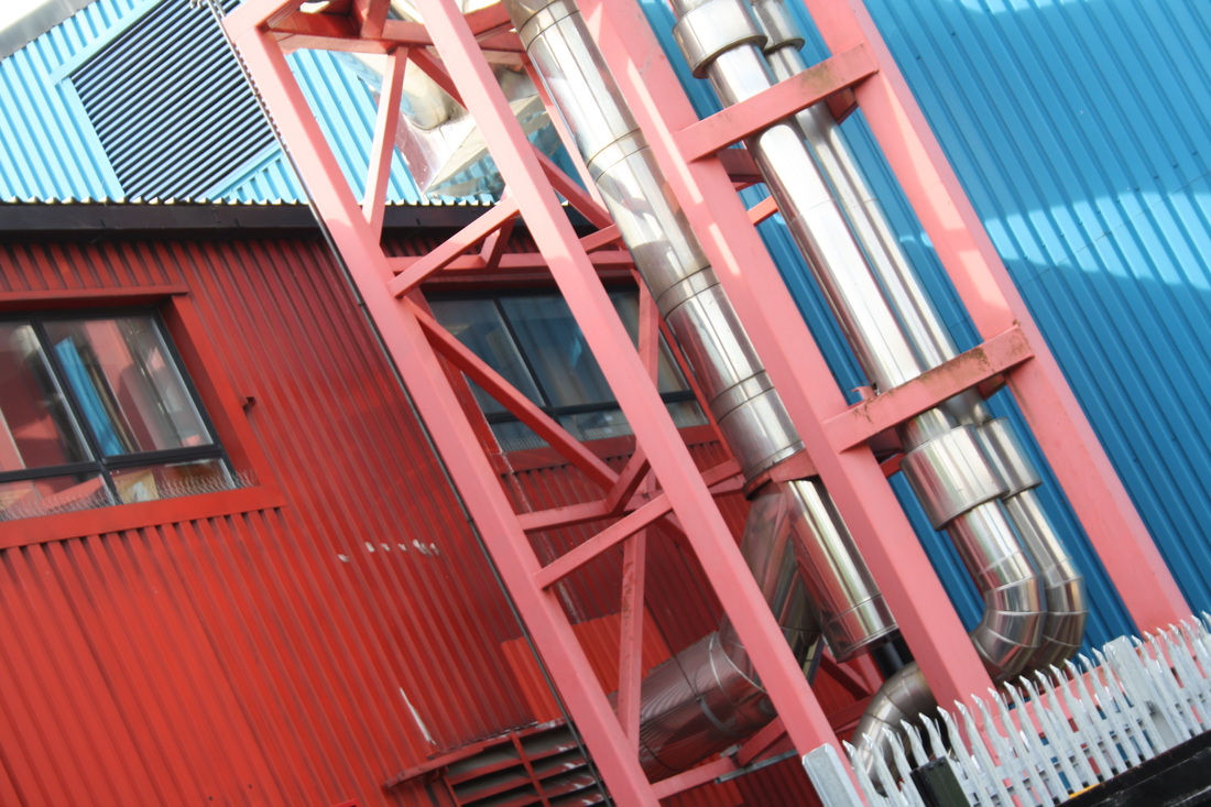
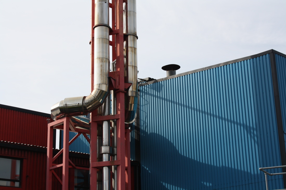
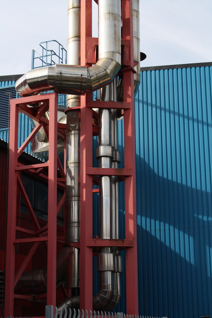
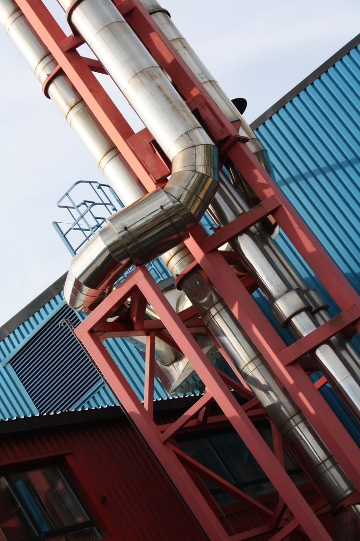
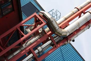
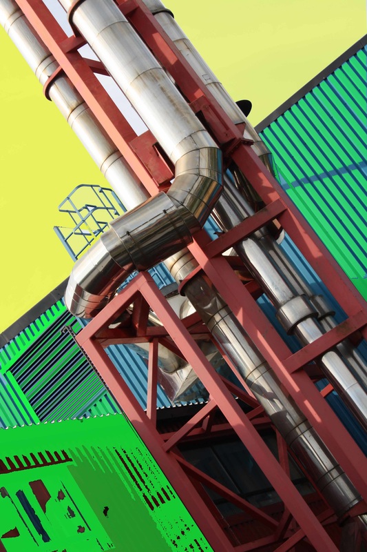
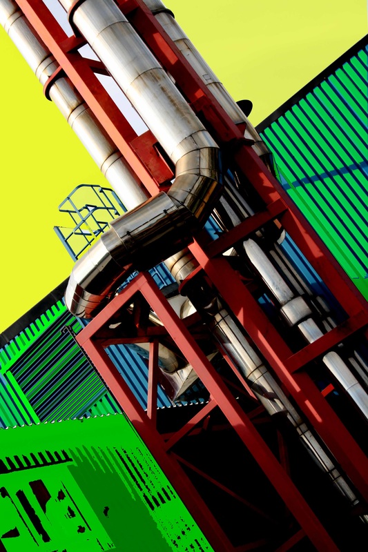
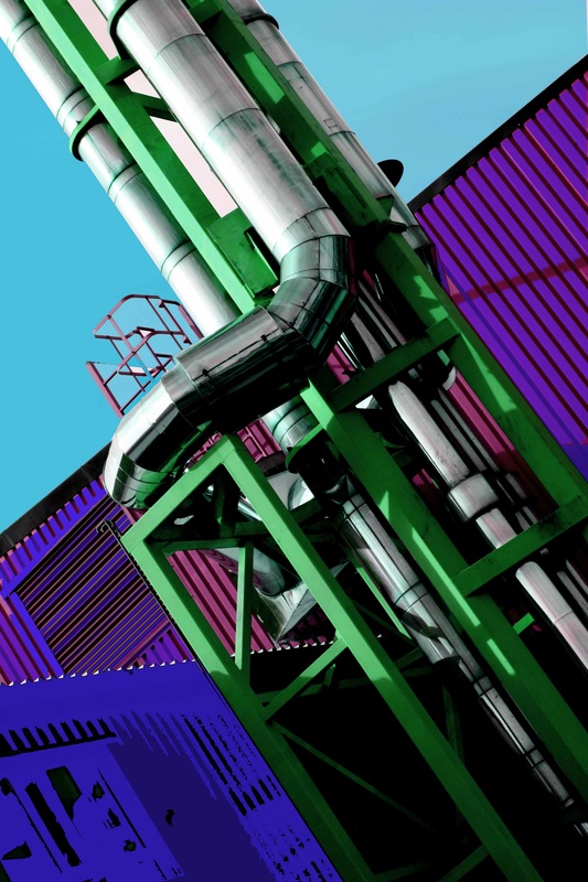
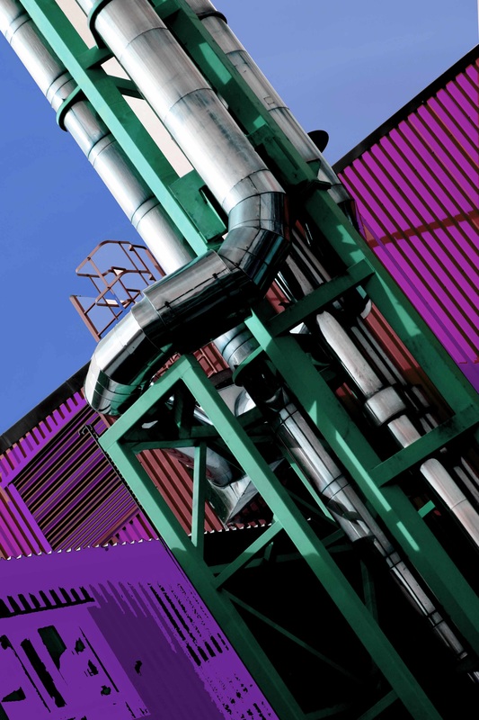
This bold photograph of the outside pipes on an industrial building made the ideal photograph to manipulate in a collage
|
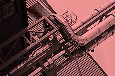    |
Refining my response to Vasconcellos digitally
Instructions can be found by clicking here

|
|
|
|
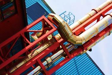
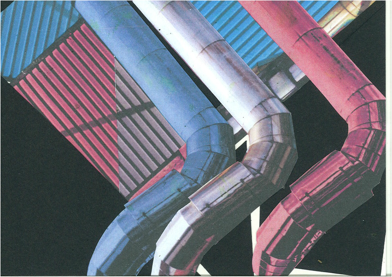
developing my ideas using collage
|
|
|

|
|
using the formal elements in a composition
laura letinsky
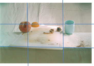
I have used the formal elements and rule of thirds to analyse this photograph by Laura Letinsky.
|
|
|
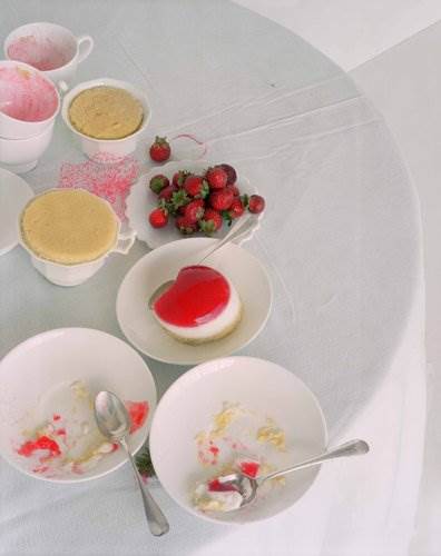
My favourite Laura Letinsky
image
This is my favourite image of Laura Letinsky's, I like the clean fresh colours against the plain white cloth and white plates. These colours are warm and pastel creating a pleasant happy mood. I like this image because Letinsky has used circles and semi circles that repeat getting smaller and smaller drawing you to the centre of the photograph. Letinsky has used lighting to keep the still life looking fresh and natural so there are few shadows. She has continued with her theme of 'how the table looks at the end of a meal‘; I imagine this to be taken at a summer party or wedding because of the fruit and bright colours. |
|
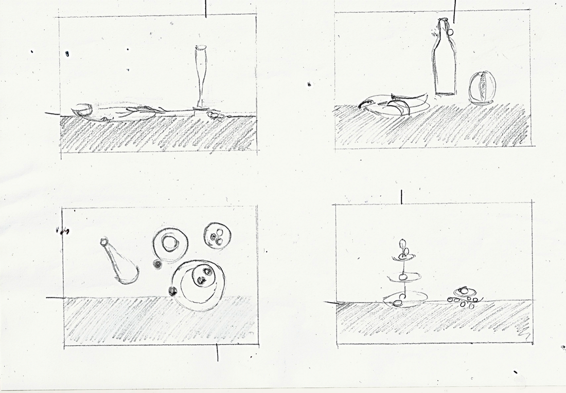
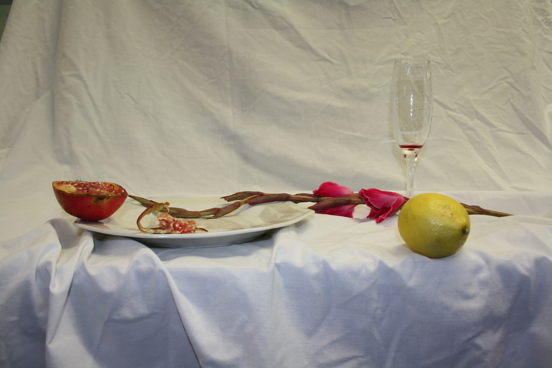
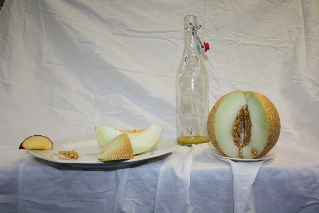
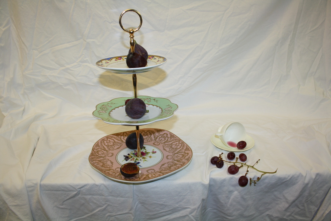
To plan my response to Letinsky's style I draw the objects I had collected. I arranged them thinking about the rule of thirds and the story of a disguarded party.